Very nice use of color and composition. I'd like it even more if you were just a little closer so we could see a little more of the subject, but I definitely love the use of negative space.
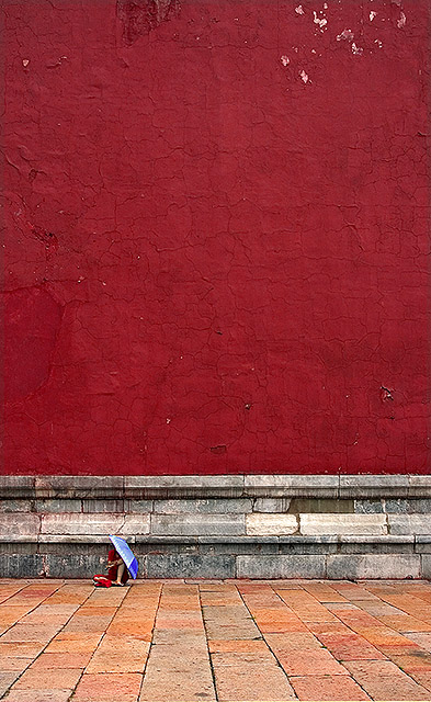
All the elements in the photo dwarf the human. The wall, the base stones and the street stones, they are all bigger than the person. That's what I like here. Also the domninace of red and orange and suddenly this tiny bit of blue stands out. The one thing that would make it perfect is a little bit of extra contrast, like +12 in Photoshop. It gives that little bit of extra depth to the colors.
Still a 9 for me.
There's something about the enormity of scale of the person, in comparison to the wall. It's a simple statement, but it's very powerful. Great capture.
This photo makes me wonder how enormous this building is! The composition makes it all worth while. I think you had your lucky day: the blue colours of the umbrella make such a good contrast. Amazing photo!
This is one of personal favourites and making the colours pop out more was definitely a good idea for this challenge. Did you sharpened it 'coz compared to your original, it seems a little rough on the outline and edges?
Very good minimalism ... perhaps too much negative space on top though. I would try cropping off the upper part just below where the paint is peeling off the wall. Lovely colors
I love the minnimalism here. It makes the illusion of the person being about as tall as a mouse. :) This photo definitaly made me take a second glance, but perhaps a slightly closer crop would have improved the image.
I almost missed the person...
What a great shot.
I was hovering over the 6 or 7 when i thought i was just a texture shot.
But this has got to be worth a 10.
Well done.
The proportion is fantastic.
Good luck
Good subject, but also well treated in this bold composition. It's the great, burning height of the wall that is the essence of this scene, and establishes the context for the tiny person to be cowering in shelter. I also like the inclusion of the patches of peeling paint at upper right - so glad you were confident enough to leave them there! 8.
This is one of my favourites so far. The figure just looks tiny and you've managed to capture the texture of the wall superbly. New one for my favourites I think. 10
I love how small the figure is, subtly revealing how large everything else is. The fact that this figure seems to be trying to protect him/herself just adds to the feeling of immensity, or dizzy disproportionateness.
I really like this photo, good composition. The person there looks like a little toy, the surroundings is much bigger than I would have thought if the person wouldn't be there. Nice work.
i've seen this before and I loved it then and I love it now. Love the sense of scale that wouldn't be there without the person. love her contrasting umbrella. 10






 Add photograph to your favorites
 Add photographer to your favorites


 Photographer found comment helpful.


