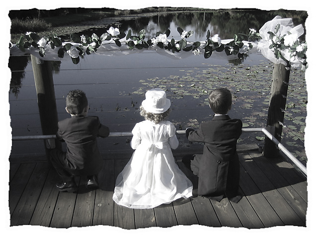
I took this photo at my brother's wedding, the kids were looking at the ducks hoping they were going to come to them, and thought it made a great photo
Did a bit of hue/saturation added a border - there you have it
Statistics
Place: 293 out of 833 Avg (all users): 5.8991 Avg (commenters): 6.3478 Avg (participants): 5.8224 Avg (non-participants): 6.2500 Views since voting: 1319 Views during voting: 601 Votes: 446 Comments: 26 Favorites: 2 (view)
Thank you Yanko, I appreciate your comment. I personally had a lot of postive comments on this photo, so that's why I entered it in Best of 2005, so imagine how shot down and disappointed I was at some of the comments. But if I didn't want it critiqued I wouldn't have entered it. I have to learn to take the good comments with the bad and learn from them. But thanks again
Well I liked the border. It does work with this photo. I don't understand some of the comments you got. Sure it isn't the most perfect photo from a technical aspect but really all the issues brought up are minor, and don't detract from the image as whole. People are just too caught up on trival things that they miss out on actually experiencing the photo. I think this photo "works" much better than several of the top ten photos in this challenge but that's just me.
Thank you everyone that voted! I was very disappointed at how most of the comments were to do with the border! I personally thought that the border enhanced the photo, but alas many didn't. Oh well, live and learn I spose.
For those that wanted to see what the photo looked like without the border, I have listed it in my portfolio.
First of all I HATE BORDERS. Now that we've got that out of the way, I like this. The b/w helps, if you asked them to stand there I would have got the left hand boy to move closer to the girl and away from the post which I think would help a bit. This photo adds to my if you're going to have a look-out, why ruin the outlook file - the wires are not helpful either. Despite the negatives, I'm still going to give this 7/10 because I like the feeling you've captured here.
You might have received a comment or two about the border... it subtracts from this image (at least in this form when I view it as 640px). The top line looks like something floating on the water - it took me a moment to realize that it is actually above the kids' heads, not far away on the water. This is a good thing - I like photos that make you think and this one did just that.
Again, slight deduction for the offensive border. 7.






 Add photograph to your favorites
 Add photographer to your favorites


 Photographer found comment helpful.


