i was going to do an awesome female of the spe cies is more deadly than the male - but i waited for help until 11:30 only to realise that i couldnt do it that way and could have done it by myself if it wasnt 11:45. Oops. Once again, i doubt i'll learn.
Statistics
Place: 10 out of 366 Avg (all users): 6.6540 Avg (commenters): 7.9063 Avg (participants): 6.3944 Avg (non-participants): 6.9048 Views since voting: 3134 Views during voting: 477 Votes: 289 Comments: 47 Favorites: 10 (view)
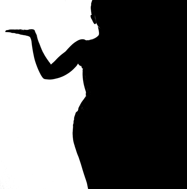
Nice pic. I like the pose, the slight lighting of the subject and there is something very spicy about the edges where the garment has altered the smooth lines of contour.
Congrats! I didn't get a chance to vote but this is impressive...
"the female of the species is more deadly than the male..." - was that a kipling reference or from the band space? Either way, I would like to see what that picture would have looked like...
Totally sucks. I give it a 1. haha. this is still among my tops. The only thing I don't like, and this is a total nitpick, is I'm guessing your undies are making your hip less smooth. 9
one of the best from the challenge. My only comment is the lines are a bit revealing of the model's clothing. This would have been very effective had the model been nude, but I understand that is always not available. 10
My favorite image in this challenge. It's clean, fits the challenge topic very well. I like the ambiguity between positive and negative space. There is a little room for improvement though. I think the distortions in the form made by clothing straps hurt a lot.
Thanks for submitting this.
Several shots in this challenge have been so graphic, they no longer appeared to be photographs. I reall like how this one has just enough light on the model that textures and lines are visible on her pants, face, and hands. Great image.
What a great idea! Very well executed. I particulary like how the outline of the jaw is still visible, yet everything else is a pure silhouette. But I would have much preferred a smooth contour, not marred by clothes. 7
Several silouhettes in this challenge and yours imediately caught my eye. This is a good example of taking a simple idea that is pretty common and adding that little twist that just makes it pop out and special. One of my best.
Really like how you have used the shape of the person to divide the light and dark. Well done, only thing I "might" have tried was to make the division on the thirds more. Would have to see it to really know if it would have worked better or not though. And you may have already tried it and not like it as well. Oh well, really do like it and hope you do well
Simple bold contrasting hue of B&W present here in this photo make me think upon the shape of the woman seen in the dividing line between the black and white BUT I also see the shape of a curvy vase set on a white backdrop. Excellent presentation and capture.
This would have more impact is the lines were smooth, i think. Was the model clothed? The underarm, waist and hip all have a bunched appearance that detracts from the overall image. Lighting is very well done, however, i like the overall effect.






 Add photograph to your favorites
 Add photographer to your favorites

 Photographer found comment helpful.


