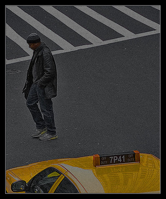
I really like this shot. It says Big city life all the way, it's simple and I think the composition is excellent. I would have given it a ten, but better care in the editing needed to be taken, the halos around the person really stand out.
Why did you title it dropping out? I see no indication that that man has dropped out. Judging just from the title and the image, this seems slightly racist. but the image itself is fab 6
This has great potential. He's a terrific subject, well framed between the taxi and the road markings. The composition is nicely sympathetic to the point implicit in the guy's body language (and explicit in your title). And of course, it meets the challenge topic well. The processing, however, is perhaps not chosen to get maximum effect out of the image. It seems grainy, flat and muddy for no apparent good reason. The potential drama of the scene is thus diminished. Something sharp and stark, but with a rich tonal range, would have been more suitable, I think. But even so, the several positives do outweigh that one negative.
Just dropped back in (sorry!) to add a further comment: The use of negative space here is very instructive. The big blank area of road behind the man is an essential part of the meaning of this image. He's dropping out because he has no reason to not do so.
Very cool composition. Good interest factor. Seems to be a bit oversharpened or something though. And maybe a matter of taste, but I'm thinking perhaps some levels tweaking, bringing out a little more brightness may be an improvement? I do really like the solid, clean composition though :-)
Too dark and grainy. What more can I say?
Actually, if it was properly exposed and cleaner, it would be a really cool picture, I like the composition and the simplicity of it. Man, cab, crosswalk.






 Add photograph to your favorites
 Add photographer to your favorites

 Photographer found comment helpful.


