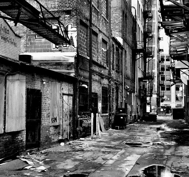
Just a standard alley in Detroit....really surprised at how well this scored! Predicted a 6. Satisfying because I actually went downtown to shoot for this challenge, something I have not been able to do for quite some time due to other commitments.
Statistics
Place: 1 out of 173 Avg (all users): 7.3255 Avg (commenters): 8.3158 Avg (participants): 6.8205 Avg (non-participants): 7.4542 Views since voting: 10950 Views during voting: 589 Votes: 384 Comments: 84 Favorites: 15 (view)
Congratulations on this image and your blue ribbon..it was my favorite in the challenge...it has all the bleakness and hard edges of an alley; this would not have had the impact in color..
I was trying to think of reasons why this city "space" photo is more successful than others. It seems as though this type of shooting can easily lead to lifeless photos that only point out the fact that there is no subject in the picture. I realized that somehow this particular photo gives the feeling that something big just happened. Like we just missed something exciting, and this is the wake that it left behind. At least that's why I enjoy your picture.
This is remarkable! There's hope for us! This is by far the most "cluttered" blue-ribbon winner I have seen here. I mean that well, btw; I love cluttered, complex, "busy" images but they rarely score well. Congrats!
u know what is funny? When i looked at this pic, I thought "wow this looks alot like detroit"...then i saw where it was taken, haha. good job and congrats!
i think the contrast and sharpness distracts the viewer. But perhaps it distracts just enough to confuse them into thinking that this photograph is profound. Because it isn't. But that's sort of the point. Dirty, coarse. There is not a subject in this particular scene which I find unfortunate, but again it reminds the viewer of the city and its "nastier" corners. detriot, no doubt.
Sad, but true. You've done a nice job composing this with your choice of viewpoint. The angles and lines come together very well. Good luck in the challenge.
Stunningly dismal! In a good way, if that is possible. This photo captures an emotion of dismay or despair to me. The look of a neighborhood that has lived past it's "glory days". Windows bricked over or covered with tin give the feeling of abandonment, yet there are still garbage cans waiting for the trashman. The B/W treatment and high contrast is wonderful.
Great work - busy image, harsh constrast, no colour - really makes a statement. I really like this shot - I'm not offended or upset at all about shots of the city like this. Keep up the good work.
I like urban decay images, especially if they're B&W and processed as sympathetically as this one. However, I think this one is just too busy, too packed with chaotic detail, to be totally successful. I'm thinking of the well known aphorism "Less is More" (by Ludwig Mies van der Rohe - appropriately enough, an architect). I think my difficulty may be not so much with the scope of the scene, but with the fact that there's no dominant element in it, so my eyes and attention wander about, not finding somewhere to settle. The result is that I make a superficial scan and pass on. That's a pity, because it had the potential to be terrific. 6.
Superb! Love the high contrast in this B&W image, every detail and texture has been brought out. I really like this shot. I wonder if it could do with a little bit of human interest or something to pull you in a little, but I still think this is fab!
Generally, I love high-contrast B7W images; this however, is overkill. I love the shot, but there's just too much contrast; a little less might have bumped this up to a "7."
The realism of this shot is what gets me. Good choice of scenes. Flat, stark and dank. My eye likes those horizontals in the foreground leading to the verticals in the background. You made a busy shot work well. Apt title. Nice going!
yessss! now this is what i am talking about!!! this totally portrays city life!!! ((unlike many of the others))... the black and white looks phenomanal here! this should do very well 10
What city is this?? Oh, wait - I know now....
Mayor Coleman Young Jr., errrrrrrrrr, Kwame Kilpatrick won't be happy with this. Not with Super Bowl XL right around the corner......It is a very telling picture with a very fitting title. It's no tee shot with the ball in the frame, granted, but a good photo none the less.
I like the shot and use of black and white - gives it a dirty, gritty feel to me. The black is just a bit oversaturated for my personal tastes, but good shot. 8
Excellent tone and contrast...excellent POV and textures...excellent everything...completely fantastic...this is such a fine documentary image, the kind of image where one just needs to sit and stare at it to let it all sink in...very well done...I'm gonna have to fav this so I can come back and look at it some more.
Challenge
- Relevant to the Challenge? Yes
- Is subject unique (vs. unoriginal or rehashed)? Yes
Compostion
- Good or Bad? How can it be fixed? Good It shows the dark side of citylife. Things that people don't want to think about.
- Good use of Depth of Field? I think a shallower DOF would work to make the buiding at the far end of the alley less sharp.
Lighting
- Good use of light? Yes
- Are there any over-blown highlights? Yes
- Good use of shadows? Yes. The add to the dark nature of the image.
- Are there any overly dark shadows? No
Aesthetics/Artistic Appeal:
- What is my reaction or feelings? I like the image because of the unique viewpoint. It's a part of citylife that most people avoid. It's dirty. It's scary. It's the city.





 Urban Reality
 Add photograph to your favorites
 Add photographer to your favorites

 Photographer found comment helpful.


