Hi, as requested, here is an indepth critique of your submission.
First Impression - the most important one: I really light your take on City Life here - an insider's view. Very creative.
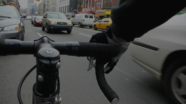
Composition: Composition is quite interesting. It is very obvious we are seeing through the eyes of a messenger.
Subject: Subject is clearly defined.
Technical (Colour, focus, and light): Colour: Color is a bit grey. This can be good, if intentional, but I feel it may have more to do with exposure.
Focus: A little soft, but this could be from vibrations of shooting from a moving bicycle.
Exposure: Quite a bit underexposed, which is affecting color.
Lighting: This was a good concept, but it seems you may have shot at the wrong time. Lighting is really flat. Appears there was heavy cloud cover, which flattens the light quite a bit.
To grow its vote?: I can see this as a wonderful late afternoon shot with headlights wizzing by the messenger. A burst of flash to light the bicycle and hands.
Summary: It was a great concept and shows a lot of creativity. However, some technicals kept it from reaching its full potential. It was however a very challenging shot.
Don't get me started! On the wrong side of the road, against the traffic! I am a commuter cyclist (30kms each way) and messengers give us all a bad rep. Oh... and the photo? ...lol. No contrast, just to greyed out and fuzzy
Thought the image was too dark. Also it was not all that strong in composition. The foreground object doesn't seem to fit with the rest of the image. Also, the car to the right and the one directly left of the object are distracting. All in all, I think a bit more scrutiny when setting up your shot and noticing every detail from one corner to the next will help considerably. If you have the ability to look through an eyepiece on your camera, sometimes that conventional technique allows you to see more than using an lcd screen, which I hardly use anymore.
Dude, you're going the wrong direction! I like the point of view of this photo. I think it is a bit dark and could have benefited from a bit more color.
Very cool idea, and I like the composition a lot. Photo could be exposed a little more, but I guess you could be conveying the sense of the city being dark and dreary looking. I still like it very much though - 8
Great concept. Are they really cycling into the traffic, or stationary beside parked cars? Composition is good. The colours are quite flat (ie: lacking in contrast) but it kind of adds to the shot - kind of says "NYC isn't that nice/happy/exciting right now for me". Great work.
interesting angle. good capture of city life. when i went downtown to take my city shots i saw tons of people on bikes so this really stikes me as the essence of city life. however the shot is very grey and not too visually appealing. 5




 Add photograph to your favorites
 Add photographer to your favorites

 Photographer found comment helpful.


