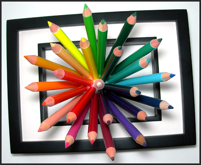
These are the mini colored pencils that I glued to half of a styrofoam ball. Cut away whatever I could of the ball so it wouldn't show. Placed all of that inside a small shadowbox picture frame on a white sheet of posterboard. Lit from the window, and the flash on the camera. The flash was too bright, so I held some paper in front of it. (I'm using a p&s camera and have nothing resembling a studio setup). Rotated, cropped, bumped the brightness, contrast, cloned out some dust and a few bits of the styrofoam that were still visible. I'm not happy with the frame distortion, but I didn't know how to fix it.
Statistics
Place: 5 out of 244 Avg (all users): 6.7992 Avg (commenters): 8.1923 Avg (participants): 6.6957 Avg (non-participants): 6.8915 Views since voting: 4281 Views during voting: 441 Votes: 244 Comments: 43 Favorites: 20 (view)
There are lots of pics with colored pencils so it is a credit to you that you found a way to freshen the idea. besides the arrangement and creativity I'm most impressed by the great DOF, all of the pencils are in focus.
This is a very original idea and it's perfectly executed given the camera and setup used. I think the frame warp actually adds to the image, the smooth curving helps to keep the eye inside the frame, giving the whole image a gentle note.
My congratulations on this lovely almost 3D like image with an attractive color burst against the white background and rising out of the frames. You get that extra bump. Returning for the final bump.
Well composed, especially wit the white pencil pointed strait into the camera in the center of the frame. Creating way to display a color wheel effect. Subtle use of black in the background to make the colors stand out. The black rectangles are angled enough to be obviously purposeful for artistic effect but some viewers may suggest they should be straight.
Wonderful idea, very effective and attrative. Your attention to accuracy and detail paid off. Nice lighting, too - if the shadows were stronger, they would be distracting. My only gripe is the angle of the frames. They are only just "off" enough to be annoying. Either straight or a more prounounced angle would have looked better.
This looks like it took a lot of work to set up - well done! An innovative idea, well worked out. I like how the frames are not square with the edges of the picture - it adds to the bursting effect.
This is just stunning. Today's entries are generally strong, but this is the best I've seen so far. The offset of colour is complimented by the offset of the geometry, and of the focal plane. Very very well thought out and executed.






 Add photograph to your favorites
 Add photographer to your favorites

 Photographer found comment helpful.


