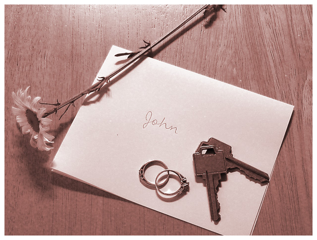
Very nicely done. The best part is, anyone could look at this without a title and they would understand it. So many challenge images are hard to 'get' unless you have a personal connection to them. The sepia adds a nice tone to this and goes along with the mood of the photo - you wouldn't want cheery colors to interfere.
Composition - Good strong topic that most of us can relate to. That is something intangible that can sometimes be hard to figure out. You've done great here. This has a great emotive theme to it. The only thing about the objects in the composition that I would have done different is to put the bloom on the flower up instead of down. But that's very minor. The rest of the arrangement is very good.
Technical - I think the mood of this photo is pretty somber and I think that underexposing this to some degree would satisfy the mood a little more. We need to see that the rings are rings and the front of the note is brightly lit. The rest of it could be relatively dark and I think that it would be more emotive. Good sharp picture and I like the toning.
Overall - Nice job with this one O. I think you chose your topic well. A little mood adjustment with the lighting and I think you jump .3 or .4 which is pretty significant. Good work and good luck in the future - Bob
Nice, visually interesting shot. Overall composition works very well; only problem in my opinion is the slight glare off the table at the top center of the frame.
Hmmm... I can sort of see where this is going. There's a bit of a glare at the top, left of center, and overall the colors seem a bit dark, but I think it meets the challenge.
My primary unanswered question is why you took this picture on a cheap plywood table - if this had been on driftwood, the effect would have been a lot more exquisite. Cool idea and good picture in any case. Bit dark, but not bad.)
Good subject and creative idea. A subject many viewers can feel engaged by. It presents a personal situation.
I would like to see a copy of this in black and white to see what kind of impact it evokes but I think this presentation is much better than a color version.





 Add photograph to your favorites
 Add photographer to your favorites

 Photographer found comment helpful.


