Author Thread
Post actions
i found this while reading the forums.
Post actions
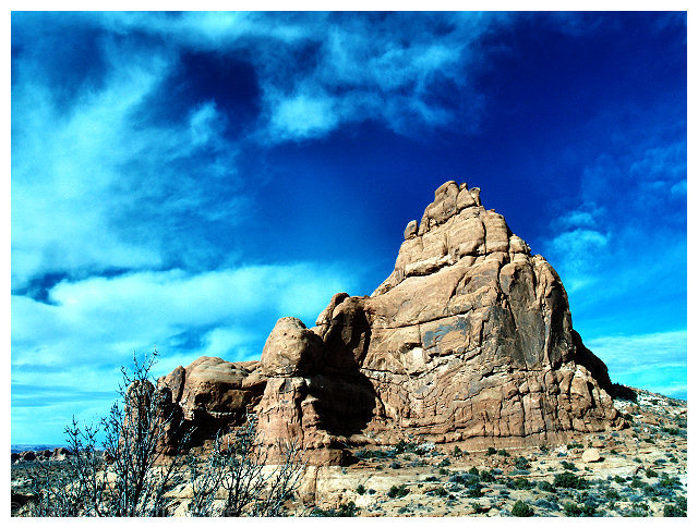
Nice image overall. The blues might be a bit too bright so maybe an adjustment of saturation is required. However, the image in itself is stunning and follows the ROTs down to the tee!
Post actions
Marc, you have something here, something AWESOME...
Comments Made During the Challenge
Post actions
very pretty, but doesnt leave me with a distinct shape
Post actions
The rocks look great - the color of the sky seems a bit off. The clouds look too blue.
Post actions
Now that is an iconic shape - well done. You've overcooked the blue so that we can see it in the rock and ground
Post actions
Good contrast, color, and composition. Utah is great!
Post actions
Post actions
Too blue, the clouds are blue, otherwise nice.....but i am not on Neptune.
Post actions
It looks to me that the original picture was overexposed. There is definitely too much post-processing for me. Maybe the colour of the sky is too dramatic, and the colour of the rock lacks of contrast. 5
Post actions
Vivid blue sky make this a very strong image with many shapes.....
Post actions
You really know how to infuse the color that is the bluest blue I,ve ever seen. or it's just the fact that I haven't seen the sky here in Seattle for a few months. : )
Post actions
Nice sharpness and composition. More brightness / white level might help reduce the feeling of the blue being overdone.
Post actions
I'm feeling "blue" about you modifications to the hue and saturation (clouds and plants). Very clear shot however. Lots of detail in the rock formation.
Post actions
This looks a little overprocessed to me. Nice choice of subject, though, and a good composition.
Post actions
lot of blue in this one maybe correcting it with ps for the colors and hue.
Post actions
really like the colors here. did you use a polar filter? i think the sky is a hue to blue. maybe it should be a bit darker.
Post actions
sky looks unnatural, picture has a blue hue.
Post actions
Simply stunning, amazing shot! 9 Good luck!
Post actions
I don't like the toning of the sky in this one at all.
Post actions
I have never seen clouds this color. I need white clouds during sunny times.
Post actions
Post actions
The color in this picture is way off...I don't know if it's the wrong profile for web or if the saturation and hue have just been skewed. The sky and plants have this weird cast that looks very fake. Pretty aside from that though.
Post actions
Way too much blue. The sky looks too unnatural.
Post actions
i like this but, i think the colors are hilighting the wrong thing. it seems the mountain should be brighter more colorful with nice reds and yellows and the blues and greens should be less touched.
Post actions
The colour of the clouds seems a bit unnatural.
Post actions
Beautiful Image, Well done.
Post actions
Would be a 9 or 10 because the picture is awesome, but has a slight yellow tone I am not sure about... 8 for a STILL great photo
Post actions







 Add photograph to your favorites
 Add photographer to your favorites

 Photographer found comment helpful.


