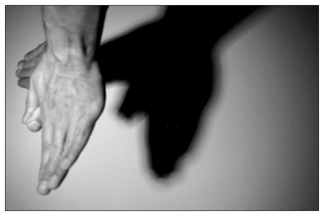
I like how you had quite a different take on shapes by presenting shapes made by shadow. My critique on this piece is that I think you could have easily cropped off more negative space on the right. It does little to help with the composition overall and closely cropping it will help maintain the viewers focus on the main subject - the hands and the shadow on the wall. Also I would have liked to have seen the hands in sharper focus - the fingers on the hand in the forefront are slightly blurred. Another element that could help in improving this composition is the close down the aperature (if possible) to increase the depth of field such that the shadow is also in sharper focus.
Interesting idea, but it's turned out as a bit of a nothing photo. A few variations that might improve it:
- Make the hands more out of focus. They seem to be almost, but not quite, in focus, which is distracting. Make it clear that you've deliberately made it out of focus rather than leaving us wondering if it was a mistake.
- Leave the hands out of focus, but make the shadow in focus, or nearly so.
- Photograph only the shadow, not the hands.
Making the photo monochrome was definitely the right thing to do though!





 Add photograph to your favorites
 Add photographer to your favorites


 Photographer found comment helpful.


