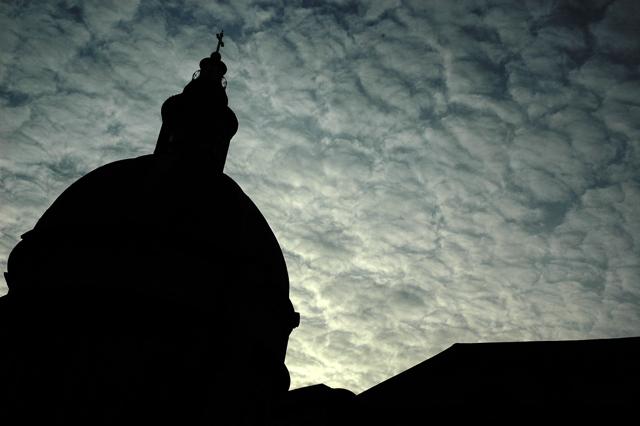
I love the gradient, and the texture of the sky is wonderful. The silhouetted building has an interesting shape. Focus is great. Exposure is just right. It is very attractive. So why doesn't this photo work better? I think it's because the two focal points (the brightest part of the sky and the cross on top of the building) are too close to the edges. Perhaps a vertical format would have worked better, both by giving more space around the focal points so they aren't crowded out, and because that orientation naturally produces more dynamic photos.







 Add photograph to your favorites
 Add photographer to your favorites

 Photographer found comment helpful.


