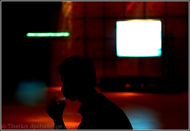
First Impression - the most important one: My first reaction to this image is quite positive. It's a very emotive image with a strong sillhouette and very interesting colors.
Composition: I like the composition of this shot a lot. There's several points of interest for the viewer, between the sillhouette of the drinker and the shapes in the background.
Subject: As a stand alone image (without the context of the challenge) I think that the subject is incredibly strong and moving. In regards to the challenge theme, you may have taken some knocks from the shapes not being the main focus. In my opinion, the sillhouette would have counted as a shape too!
Technical (Colour, focus, and light): Technical aspects of this photo are spot on. There's no noise in the dark portions of the photo and both the light and colors are stunning!
To grow its vote?: I think what hurt the score here was probably what I mentioned above...the fact that the main point of focus is not the defined shapes you see in the background. In terms of the challenge, perhaps it would have a higher impact if the shapes of color were in focus and the sillhouette of the drinker was the blurred part.
Summary: Truly a great image! I wouldn't change a thing about it, really :-) I think you took a great shot that you can really be proud of. In terms of shooting for challenges, you often have to decide between doing what pleases you and what might please the voters more. But, all in all, a great job I think.
Your point of interest here is the drinker - I think this is a great photo - and it does have shapes, but I don't think that shapes are the first thing I think of when I view this shot.
you're probably going to recieve many critiques about whether this picture meets the challenge or not, anyway, i like the lighting and the way the silloute of this guy stands out of the background.
good luck
Overall, the lighting is good. I like the silhouette holding the glass. I find the bright rectangle to the right very distracting as it keeps pulling me away from the drinker. It is also the strongest "shape" in the image but does not appear to be the primary focus.
Your image does contain strong shapes, but for me they seem more a distraction than the focal point. I think the points at the hand and head where the drinker get lost in the background are also weaknesses.
Like the idea and the silhouette focuses the viewer on his shape, however the really light square (tv?) and bar above the drinker's head are very distracting. As is the flare of light in front of him. Good luck - 5







 Add photograph to your favorites
 Add photographer to your favorites

 Photographer found comment helpful.


