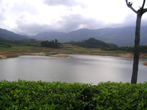
This looks like it could be great, but I can't really see anything as the shot is so small. Resizing to 640 would have helped with this. Would also have been nice to straighten the picture in your editing software as the tree and horizon make it a little giddying.
composition - would straighten the horizon - looks tilted. Also - would try shooting this from another angle as the tree is distracting, and the waters edges are oddly cropped off.
exposure - the sky is very blown out - very little detail left in the clouds.
I think here, the main problem is DoF. There is a hint of scenery but it's strongly marred by being OOF for most parts, with the sharpest area being the foliage foreground. In fact, it might have been better to just crop that part out to direct the viewer to the landscape beyond. Other elements that don't help this image are:
- the tilt of the landscape, seems to slope down to the right. Most editing software can easily correct this by just rotating it to the degree needed
- the sky looks blown out (over-exposed)
- the colour suffers from the glare as well (I could be wrong and if I am, I apologize, but this looks like it was taken around mid-day when the sun was highest)
Finally, for a scenic image, a bigger size is better.
oh hell yes. this is fantastic. Not sure if Ed Clarke has been to Paris or not, but if he had - He'd take something great like this (e301 - one of my absolute favourites on DPC).





 Add photograph to your favorites
 Add photographer to your favorites


