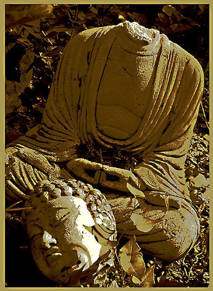
I personally do not care for the artistic effects. I would have liked to see the picture as it is in reality. I think the subject speaks for itself without added photo enhancement.
I like the idea of this shot, but I don't really care for the coloration. To me, it takes away from the image and it's message. (Clipped the knee a bit, too!) 6 Rob the Swash
I cannot tell you how much I loved this photo! I CAN tell you I don't care for the frame, even if you did match the colors perfectly. It distracts from a strong, strong image and it loses the enormous power it should have. Just my opinion, I realise, but...
I think this would've been a better entry without messing with the colors so much. I'm sure it would've. The leg is cut off a bit, but the rest of it seems pretty good. Not sure why the colors were altered so drastically.
Poor Buddha! A nicely composed photo with the head and shoulders at the thirds. Colors seem overprocessed, which I don't mind very much, except that in this case, it doesn't enhace the photo's feel or mood or communication.
If this weren't so harshly postprocessed, I could rate it higher. The flat white areas and speckles on the head in particular are jarring - it makes it look like it was painted, or has a lichen growing there. Still, 7.
why is the the statue beheaded
why the border
why the duotoning
I think the original shot without the post processing would have been MUCH better a 4 I think it could have gone as high as an 8 without the processing





 Add photograph to your favorites
 Add photographer to your favorites


