Congrats on using the HM. :) I think you got helpful comments from it. The experiment (despite Karen's reaction and I do like Karen) is working so far.
I liked this shot, gave it a 7 and would have given it higher had I been more interested in the subject.
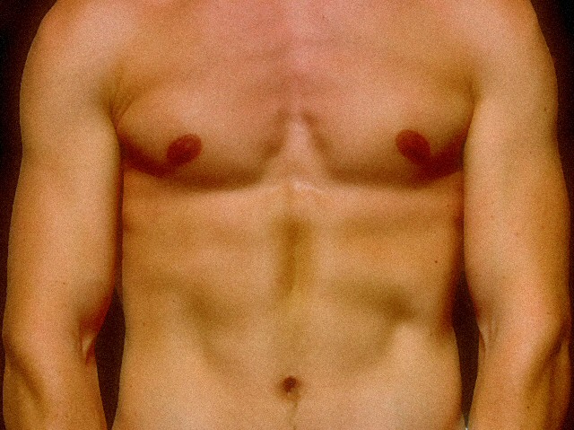
I like everything here but the straight on composition. The light, colors, soft focus are all wonderfull but posing him like that makes the picture boring and worse, I keep seeing a happy face with his nipples the eyes with dark shadows, the bellybutton the mouth and the lines of his stomach a smile with dimples. ...Or did you mean it to be a face?
Don't like the graininess of it. I think you should've went with something besides head on. Now if this were a chick, that's a whole different story :)
I like the torso composition. The grainy treatment with the saturated colorsfits well. Something is missing in the lighting. I would like to have seen more definition - maybe more side lighting and high contrast. I like it.
this picture is too grainy to be in colour... converting this to b&w might be the best choice. if you keep it in colour, the skin tones are more olive toned in the upper abdomen area compared to the skin tones between the model's breasts. also, there is the slightest hint of underware on the lower right hand side of the pic... just a slightly tighter crop would be better.
hope this helps, i think this picture is worth working on. -7
This is very nicely done... nice lighting... I like the graininess of the photo... almost looks like you or whoever's nice looking torso this is, was covered in sand. Interesting what you chose to do with this. Good luck! -8-
I don't like the grain on the shot. A clean smooth look would have given so much more character to the skin. The subject is somewhat interesting, but probably needs a more compelling angle or lighting to make it draw the viewer in.
I think you added the grain to the pic. I really don't much care for it but it is different. It makes it look like you were trying to hide something, and I see no need for that. 6
looks really grainy. If that was the intent, I think it's a bad choice, since it would seem you'd want to enhance the definition for this type of shot. If not, you either need better lighting, or find a better way to compress your photos to meet submission criteria.
Interesting use of symmetry, very nice lighting that really brings out the human form. It looks like the grain is intentional, but I'm not sure that it adds to the image for me as a viewer, personally.
The blunt response from me is: The HM has gotta go! LOL :)
a slight angle of the body to the camera would be nicer. straight on has little appeal. The lighting is fair, and the skin tones could be less green and grainy.
It is an interesting subject because of his physique. Perhaps that could have been enhanced with more creative lighting?
good luck, and have fun!






 Add photograph to your favorites
 Add photographer to your favorites

 Photographer found comment helpful.


