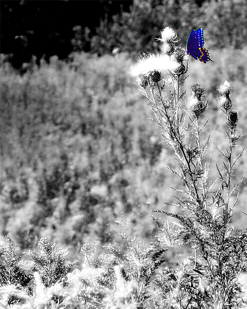
First Impression - the most important one: Lovely colors in the butterfly, and I think selective desat works well for this shot.
Composition: Composition on this shot is pretty good. If you were going for a more minimalistic feel, I think the crop is just fine. I personally might crop out a little bit from the bottom. I think there's enough texture and black & white space to make the butterfly stand out even if the bottom of the plant is cropped out.
Subject: I like the subject of this shot quite a bit. The delicate shape of the butterfly really contrasts well with the woody texture of the plants in the background.
Technical (Colour, focus, and light): Colors on the butterfly are very vivid, thoug the butterfly looks a tad oversharpened. I like the selective desat in this picture and I think it works well for the challenge. I like the DOF too, with the texture of the thistle being in focus (as well as the butterfly) and the background plants just adding to the scene more quietly. There are some portions of the plants where the white highlights look slightly blown out...could likely be fixed with a little levels adjustment.
To grow its vote?: To grow its vote, I would fade the sharpening on the butterfly a bit, and be certain not to blow out the highlights. Those things really seem to catch the voters eye (as I've had to learn myself!).
Summary: A good concept for this challenge, with a good follow through. Just a couple of simple nitpicks to possibly improve the score on this lovely photo.
I think this is a bit overdone. A butterfly's body wouldn't be the same colour as is wings... (and I think selective desaturation is a bit of a cop-out for this challenge).
Very nice use of selective desat. IMHO I would have liked to see the butterfly weighted heavier in the composition. Just my opinion, nice shot nonetheless
Hmm.. a lot of negative space here, maybe a crop would do it justice, but my eyes are distracted from the butterfly and looking down at the other plants.
I can tell that you were using a shallow dof here, but the removal of the color makes it all sort of fuzzy and hard to figure out. The butterfly too seems overprocessed and unnaturally colored.
seems to be too busy for me (even in bw), tighter crop of the butterfly - if possible - would probably help to boost contrast as well as catch more attention






 Add photograph to your favorites
 Add photographer to your favorites

 Photographer found comment helpful.


