7 - Like this and the perspective used. Criticism; for the symmetry, this looks like it needs a fraction nudge rotation up on the left. The blown area back left is slighty dominant, but fairly minor.
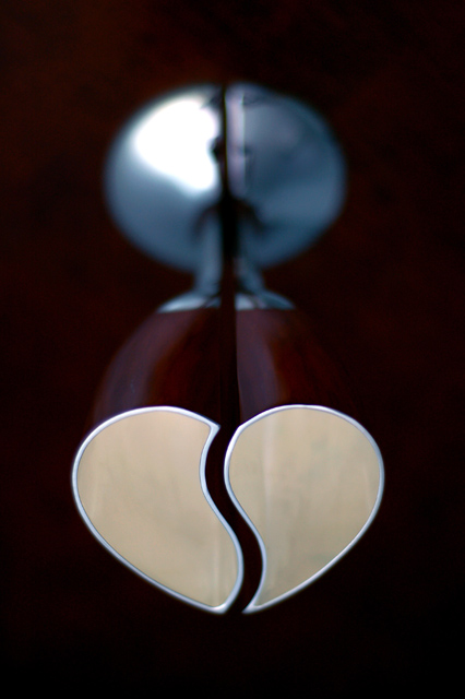
Pleasing and meaningful shapes. Wondering if there is some way to get less central composition, but I like it the way it is anyway. Very nice, and I'm looking forward to the details.
wow very cool. i like the light coming from the inside of the cups. i think i would like it better if the heart was on the top of the image and the base on the bottom..






 Add photograph to your favorites
 Add photographer to your favorites


 Photographer found comment helpful.