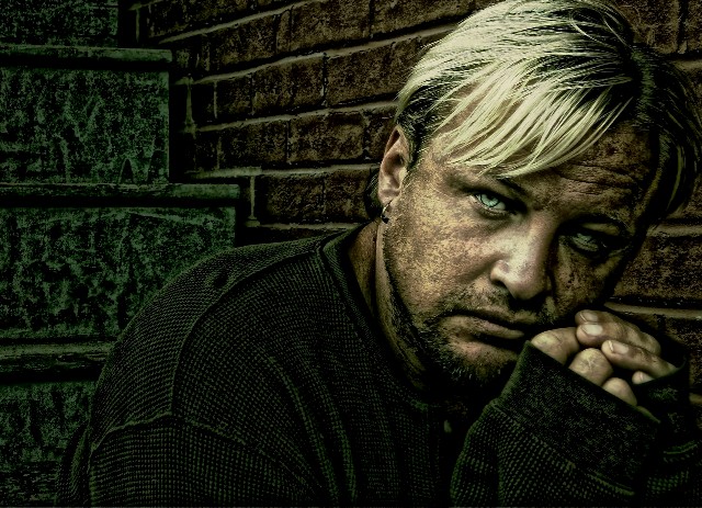
Self-portrait. This shot means a lot to me on a lot of levels.
I'm glad I have the opportunity to see how this will score in a challenge. I know that it was well received as an image in my Portfolio - and I thank you all for the comments and favorites!
EDIT: Winner in the 2005 Nancie Mattice Awards at Dangenart Gallery.
EDIT: Honorable Mention in the Self-Portrait category of the 2006 IPA competition.
Statistics
Place: 173 out of 833 Avg (all users): 6.1927 Avg (commenters): 8.0417 Avg (participants): 6.0718 Avg (non-participants): 6.7838 Views since voting: 2005 Views during voting: 695 Votes: 436 Comments: 54 Favorites: 4 (view)
Congrats on the gallery thing. I gave this a 9 in "Best of" and it was one of my top five. Really a very emotionally gripping shot, and the technical aspect is superb as well.
I am so surprised this did not do better. I thought the grain treatment was spectacular. I also liked very much the brushed look of the hands and the background. I gave this one a 10. I thought it was one of the best portraits in the challenge, along with the image of 100 and counting. It is very artistic. That is probably why I loved it so much.
hm, this looks like it used a technique i've found quite interesting-
don't know if this is what you did, but i've done it a few times-
duplicate layer
dupe to B/W
copy B/W
invert top B/W layer
change overlay mode to "Hard Mix"
add slight gaussian blur to hard mix layer
merge B/W layers
change B/W layer overlay mode to "Multiply" or "Overlay"
--except when I do it, it's mostly just a "hey, this is nifty" kind of thing; here you've made the grittyness and ultra-detail-enhancement really work. the eyes especially are great.
Jimmy...I loved all these shots in this series so this one is no exception...amazing eyes and great processing. Prolly a bit overdone to most folks, but I'm weird like that. ;) Great work!
Im so glad you decided to submit this for the challenge. I love this photo of you. I get alot of flack for my editing style, as I am sure this self portrait must be getting, but its really one of my favorites in your entire portfolio. I would like to know why you named it Hollow though.
Rather than making you stand out as in this image, your challenege entry almost blends you with the background and works better in my opinion. It accentuates the emotional impact
So glad you entered this shot! This is amazing in every way. The processing is perfect and the composition couldn't be better. The expression says so much. The whole mood in this shot is very well set. Very emotive, strong and powerful! Extremely well done! A perfect 10 from me!
Ten.
I've said it before but I'll say it again: this is an amazing, excellent SP Jimmy. This photo has soul and depth and everything that a portrait (self or otherwise) should.
I'm not really a fan of the post processing here, but I'm trying to imagine how the shot would look without it. Its a very nicely composed portrait with a good dark feeling and nice expression.
as a portrait this would qualify as a great, but after post processing I just don't like it, it's overworked, the skin is not looking like skin, the eyes look fake and so on...
BUT I know you were going for some kind of grunge effect, but it's not working, even though overworked, it's not nearly overworked enough for that..
take a look at Joey Lawrence's work and you see what I mean, his work is exceptional.. he will be one of the "Bressons" of the 21st cenury :)
I like the composition and the eyes - especially the eyes. Overall for me though, with the post-processing, it appears more of an illustration or almost a 3-D rendering rather than a photograph. 8
I'm sorry but I think it is far too overprocessed, the guy's cheek comes over way too dirty and takes on the same texture as the background bricks. I like grungy images sometimes if they are done in a way that is not too extreme. Otherwise the compositon is good, the lighting is also spot on and the color tones are also fitting to the image. But just a touch too overdone for me.
Interesting. His eyes are amazing, very intense. I have never been a fan of this type of processing, though. It's just too much and over done, giving a plastic like appearance to the photo.
Now this is the kind of photo I really like. Great setting, very interesting processing you've used, I really like it. I feel captivated by his eyes/look. The image grabs my attention and keeps my eye anchored to it. I even really like the title. A very thought provoking pic. Very well done!
I absolutely love this shot. The earth tones, textures and grain add an element of grit to the photo and his expression does the rest. I'm drawn to his face and eyes. The composition is genius and the processing job is brilliant. I expect to see this near the top of the challenge results!
I'm a wee bit disappointed you did so much post-processing on this shot - I think it probably spoke for itself. Anyway, I do like it and I hope you post a more natural version in your profile after the compo is over.
Where to start....The colors are all dark and grungy adding to the feel and mood of feeling desolate. There are textures present in this photo that makes your eyes explore and "feel' this man's 'environment' The green steps and the brick wall are dirty, gritty - which is the feel and mood of this photo. But what really arrests the viewer is the man looking at the camera. His ice blue eyes drown us in a sea of sorrow and despondancy as we look upon his face that speaks of homelessness...





 Add photograph to your favorites
 Add photographer to your favorites

 Photographer found comment helpful.


