Crop, saturation, sharpen, dodge, burn, little o' neatimage, levels and curves. Rinse. Repeat.
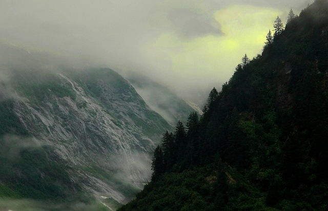
Well, it looks horrid in 640 pixels compared to how incredibleit looks as a 36x30 print hanging in my front entrance.... Still, I'm marking it as my favorite for 2005 and entering it as such.
Statistics
Place: 246 out of 833 Avg (all users): 6.0231 Avg (commenters): 7.6842 Avg (participants): 5.9748 Avg (non-participants): 6.2500 Views since voting: 978 Views during voting: 565 Votes: 433 Comments: 21 Favorites: 2 (view)
Not too keen on the coloring in the light.. it reminds me of old illustrations in books before they had a pallette of more than 4 colors. Compositionally it is very interesting, and is probably a concious effort at a visual style, but I just don't like it.







 Add photograph to your favorites
 Add photographer to your favorites


 Photographer found comment helpful.


