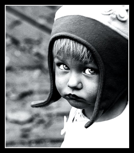
This is a portrait of a little girl I met at a local park. She was very interested in staring at me, so I was fortunate enough to have captured a few special photos of her.
Statistics
Place: 227 out of 833 Avg (all users): 6.0650 Avg (commenters): 8.3250 Avg (participants): 6.0667 Avg (non-participants): 6.0563 Views since voting: 1878 Views during voting: 707 Votes: 446 Comments: 55 Favorites: 16 (view)
I love the vintage look in this photo! looks like she walked out of the 60s (?). allthoug the white parts of the photo are blown out, I don't mind in this photo. the eyes of your model are intruiging. love it, bump you to a 9 :)
Lovely B&W, it looks so old and I like that kind of photographs. The big eyes connect to the viewer. The only 'flaw' is the burnout of the clothes and I would like to see more environment to get a better story.
This has such an "old" feel to it. Great look. Please post your Post Processing in the comments box and I'll come back for a read after the challenge finishes.
Looked for another 5 mins and his is real grower, I think this is one of the strongest images I've seen yet on my voting. Absolutely love it.
New Favorite. 10
Mmmm, I know this picture and like before, find the stare and expression to be marvellously captivating! Nice treatment. Not one to pay attention much to titles but that's the only thing I don't like here but no worries. No points off for that.
I prefer the processing you have done to this image compared to the same image I saw in your portfolio some time back. I can see you put more time and thought into it. This has so much more impact and this time I will favourite it :)
This reminds me of an old photo from the the 40's or 50's. Love the black and white/grunge effect. The eyes are so clear and full of emotion. Beautiful shot.
Great processing. Very emotive photo. I like the grain, I think it adds to the image nicely. This one looks familiar, I think I've seen it (or a very similar one) :-) I like it though, well done!
This has quite a retro feel to it. I really like the eye contact, the high contrast, high noise black and white treatment, the strength of shape given to it by the edge of the cap and your crop.
Would look better if there were some texture in the white shirt, is too over exposured for my opinion, a bit too much contrast I guess. But what do I know! I like everything else about this picture, it's a 8
Great expression! I like the crop as well. The conversion is a little contrasty for my taste, but it works. I like the added grain too. I think the eyes look unnaturally dodged. The butterfly in the hat draws my eye a bit away from her face, so I might have cropped down a bit further, but that's just a nitpick.






 Add photograph to your favorites
 Add photographer to your favorites

 Photographer found comment helpful.


