Greetings from the Critique Club. After reviewing the photo I have some suggestions and some comments.
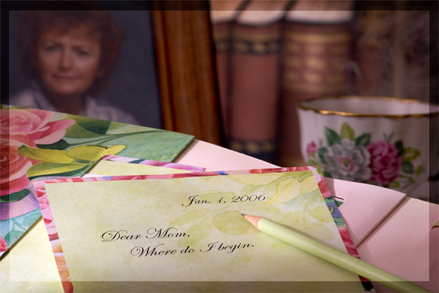
Challenge met, good representation of Mother this is a nice emotive photo. Good use of DOF to add to your presentation.
The color seems a bit flat, perhaps bump the saturation, and the contrast a little to help make things stand out. The photo seems a little busy, I might have taken the books and the cup out of the photo and left some empty space to help draw the attention to the photo and the letter. I think the letter being printed and then having a pencil in the photo takes away, I would have liked to have seen a Pen and handwritten, or if you used the pencil the writing to be in pencil. Overall a good entry. Good luck with future challenges.
I think it would have been more powerful if the writing was done by hand. This looks too "staged". Generally I don't prefer pictures where words are the subject or important to the meaning. Just a personal preference I guess.
Something bugs me about this and I haven't worked out what but I kind of like it too. A little cluttered perhaps? Maybe the fact that Dear Mom is done on the computer and not the pencil in shot? I'll work on it
Very emotive image. Colorful, bordering on being busy, but presented well. Great use of dof. I am drawn into the image, wondering what it is that will be said in the letter. Very nice. And that is wonderful writing. Was that really hand written??? :-) Good overall, I'm not crazy about the transparent border, in this case it seems to be a bit distracting. Maybe a small solid border could work? Nice job.
great idea but its lacking a little spark. I also find it strange that the letter appears to be typed and there's a pencil on it... should have been hand written imho.
I like the idea for this shot. Overall, it looks quite nice. I would much rather have seen the card handwritten, though. Having it machine-printed takes away from the realism, esp with the pencil.
I like the way the picture focuses in on the letter.. but I find it a bit strange to read the typewritten words and having the pencil lying there. The words you've chosen leave a lot of room for interpretation by the viewer too.
since the pencil is there, i would have preferred the writing be in pencil too. or put a pen to give the impression it was written, rather than printed out as it appears now. nice concept and good colors.





 Add photograph to your favorites
 Add photographer to your favorites

 Photographer found comment helpful.


