Hi, as requested, here is an indepth critique of your submission.
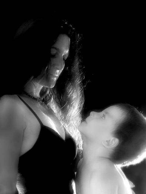
First Impression - the most important one: My first impression is that it is too dark to feel motherly. Also, high contrast vs. diffuse glow is sort of contradictory to me.
Composition: Composition is good. Follows rule of thirds quite well. Compositionally, you nailed this image.
Subject: While the overall subject of your shot fits the challenge, the forementioned contrast and darkness diminishes the effect the subject has. Also, as mentioned below the outfit does not fit the idea of mother well.
Technical (Colour, focus, and light): Colour: I like your treatment of this in B&W, if not for the high contrast I would love it.
Focus: Fairly sharp. I'm seeing a little motion blur on your child that diminnishes the focus some.
Light: A bit harsh, considering your subject. Also, we are seeing a few hot spots around the photo that draw attention.
To grow its vote?: Soften up the lighting some, lighten up the scene. Mother tends to be a soft subject, so high contrast doesn't work so well here. If I were just seeing the photo of just you, I would consider it a nice dark portrait, but just doesn't work for this subject.
Summary: A few lighting technicals kept this photo from reaching its full potential. COmparing it to your other work, it just doesn't stand up to your talent. Maybe you were rushed or something other distracted you, but this time you just didn't put your best foot forward.
Please, don't take my critique as harsh. You are better than this photo is all I want to really get across.
I've come back to this 4 times now trying to comment on it, but find myself in a quandry every time. It meets the challenge, no doubt in my mind. I like the diffuse glow a lot, as well as the black and white treatment and the composition. My perception of the interaction between mother and son throws me, and though it has no bearing on the quality of the image, it does effect my overall emotional reaction to it.
the lighting on this is sort of surreal. In my opinion that doesn't mesh well with the sternness of the subject. Makes for an interesting-looking image, though.





 Add photograph to your favorites
 Add photographer to your favorites

 Photographer found comment helpful.


