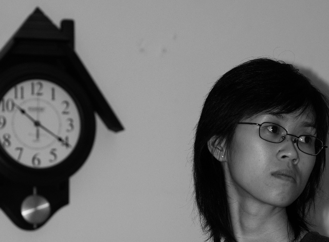
well this is a pix, minimalistic feel, negative space in wrong part of frame, b&w need help, light flat, flow of image is confusing, comp needs help, overall try again
what is time up for? I'm not able to tell much from this image. Harsh shadows to the right of the person. Odd spots on the wall inbetween the clock and the woman are distracting.
I like the idea but I think the 2 subjects should be close together more in the middle of the frame. I find how they are each partly out of shot quite distracting.







 Add photograph to your favorites
 Add photographer to your favorites


 Photographer found comment helpful.


