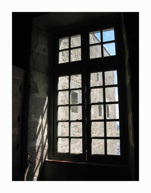
I've always enjoyed photos that study light and dark patterns through windows, doorways, etc. My favorite part of your image is the shadow cast on the inside wall.
I really think this would look a lot better with a black border (maybe thinner too) or no border, as I find the white distracts me and stops me being able to see the shadow detail since the contrast is too high.
tough call on the framing. I bet you're getting a lot more comments about that than you'd care to. I can see why you chose to give this photo that much space... I think it needs breathing room, too. I think just a *bit* smaller might have been better. This looks like maybe a 40px border... 20px is pretty common, but anything more than that is going to attract disproportionate attention. If this were framed, there'd be no other way to do it (and it would probably need an even wider mat), but I'm not sure it translates quite so directly to web viewing.
It's thought provoking. To me though, about twice as much border as needed and about 10x more than would be perfect to me. IOW, no border would have been preferrable to me. 7






 Add photograph to your favorites
 Add photographer to your favorites


 Photographer found comment helpful.


