Challenge
- Relevant to the Challenge? Yes
- Is subject unique (vs. unoriginal or rehashed)? Yes
Compostion
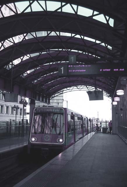
- Good or Bad? How can it be fixed? The biggest problem with the composition is the huge patch of sky in the background that is washing out the colors and details. I'm assuming that you were shooting toward the sun. Looks like it's coming from the upper right. Good leading lines of the platform. I can't decide if a tighter crop would improve things.
- Good use of Depth of Field? No. I would use a narrower aperature to have more in focus, especially the sign overhead.
Lighting
- Good use of light? No
- Good use of shadows? It's hard to tell because the image is do dull. It's really hard to see the details because of this.
Aesthetics/Artistic Appeal:
- Colors and Contrast Needs work to make the image brighter and "Pop".
- Sharpness. Needs to to make it sharper. Better focus, DOF, and Unsharp Mash would help.
- What is my reaction or feelings? I occurs to me like a tourist snapshot. The subject is good, but the technicals aren't quite there, yet.
i was wondering when i was gonna see a public transportation shot. i like it but it could use a little work with contrast and levels and perhaps make it a black and white
Interesting colorisation (I'm assuming), although I'm not sure what it adds to the image. I travel to the city every day by train, so I understand how it becomes a part of life.
this is much more city ish than most of the shots, but your focus is a bit soft. Also i'm not sure why there is a purple cast on the shot as straight black and white would have worked fine






 Add photograph to your favorites
 Add photographer to your favorites

 Photographer found comment helpful.


