This is my first entry to a "member" challenge - I know I'm allowed "advanced" editing, but I'm still only capable of "basic" :)
Thanks again to whoever purchased my gift membership - it was nice being able to contribute to this particular challenge.
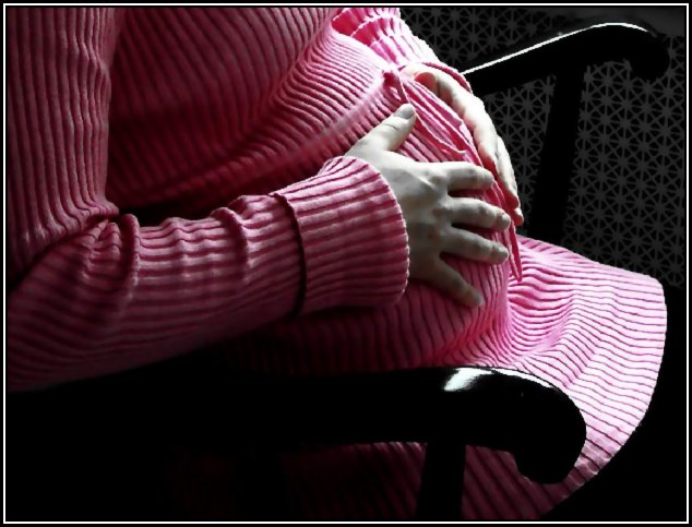
Thanks to my model, Sarah, expecting a baby girl due February 14th. I promised her some prints of this and some others that I took for her Baby Book :) and though she said it was fine, I felt hesitant to place her face on the internet, so this image is actually a zoom in and crop of a full image.
Editing: rotate, zoom, crop, auto levels, desat, blackpoint, gamma, contrast, despeckle, sharpen, re-size, and border.
Notes: I just wanted this to have that soft look without being too blurry - but it doesn't seem I could do it just right. Also, lighting seems to look a little blown out - especially on her lap. Full color was nice but a bit too harsh, black and white was also nice - especially the contrast of her sweater detail but I'm going with this desaturated version because I think the pink adds some femininity.
I still have lots to learn......thanks for all the votes and comments, I appreciate them :)
Statistics
Place: 52 out of 125 Avg (all users): 5.6631 Avg (commenters): 6.1333 Avg (participants): 5.4189 Avg (non-participants): 5.7500 Views since voting: 1077 Views during voting: 437 Votes: 282 Comments: 19 Favorites: 0
Hello Shannon, it's me from the Critique Club again!
(I'm not stalking you; these critique allocations are quite random, so the fact I did one on an image of yours just a week ago is just an absurd coincidence.)
I like this one a little less, as it happens. Technically it seems OK, especially the raking light, which I think came from a window. The desaturation has made the light look a little cold, especially on the hands - it was probably a little 'warmer' than that in the original image. On the other hand, the desaturation has been used with a purpose, and a purpose that is consistent with your aim for the image. I personally don't care for desaturation too much, but at least you've had a reason for doing it (most people don't seem to). The composition and crop is not too interesting ... I know you didn't want to show Sarah's face here, but this alternative does rob the image of much of its potential meaning. The hands do their best, but it's faces, and specifically eyes, that tell the story of the kind of emotion you are after here.
There are some compression artifacts visible, especially on the curve of the near chair arm. I think you'll eliminate that if you save your files for DPC to the permitted maximum of 150KB (yours is only 55KB).
Here's a link to a tutorial that will help you to size and save your images to best advantage on DPC.
Nice to see you again! Best wishes to Sarah ... a baby on Valentine's Day, that's pretty memorable.
Paul
I'm guessing this is windowlight. It's a little harsh and we are left with a bluish tint to mom's hands. The idea in nice though. I'd like a portrait crop and to see a reflective look on mom's face.
I like the composition and the classic (if a bit cliche) placement of the subject in a rocking chair. I don't for the busy texture that the ribbing on the sweater creates in combination with the radiator grill in the background. I also don't care for the choice to crop out her head. Why not show future mom's expression?
This is very nice - the window light is wonderful. Her hands look so gentle on the baby. All the leading lines point inward right to the center of the belly, draws the viewers attention and keeps it. i like the background wall paper as a contrasting texture.
beautiful idea, great lighting, there seem to be some compression artifacts, and the hands seem unnaturaly desat? strange colors (specially on the right hand). Perhaps a little more space for the elbow to fit would be nice






 Add photograph to your favorites
 Add photographer to your favorites

 Photographer found comment helpful.


