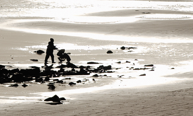
Taken into the sun on New Years day. I had a short lens on the camera so this is a HEAVY crop from the the frame. The full image works quite well but for DPC the woman and buggy are lost at 640 pixels. DPC leaves us pixels to spare, so why not crop it hard =)
It's been straigtened, cropped (this represents around 25% of the original shot), curved and sharpened.
I like the high-key, semi abstract nature of this shot and I'm really interested to see what the voters make of it. My first ever member challenge, maybe I'll advanced edit the next one =P
Statistics
Place: 54 out of 125 Avg (all users): 5.6196 Avg (commenters): 5.7500 Avg (participants): 5.4054 Avg (non-participants): 5.6980 Views since voting: 865 Views during voting: 448 Votes: 276 Comments: 16 Favorites: 0
I really like this photo. It's strange because it's just so 'opposite'. It was interesting that you cropped it down from a much larger photo. Looking through your portfolio you have some work where you show a great eye for framing and the crop on this, in my opinion, is no exception. The nice rock in the foreground and the pattern of rocks leading to the sea help build the illusion that the person pushing the pram is walking toward the water where actually they are not.
As mentioned in a lot of your comments it's the blown highlights of the sun belting the water which I think cost this photo in votes. It just makes the image look a little bit harsh but at the same time, I could imagine this piece put back in the original photo which may paint a different picture. Maybe a polariser, as mentioned, would of made of a really different looking image?
The focus you have here looks good and the depth of field is great from front to back where you've cropped it from the larger file. The silhouette of the person with the pram is sharp and well placed in the frame.
All in all I liked the photo but it was just those highlights I think that cost you. Congratulations with your score and from looking at your portfolio you're in for a big year. Well done and best of luck!
The brights are a little too bright for my eyes, but I really like the abstractness of this. I like the way the sand merges with the water so that appears the pair is about to walk into the sea. Nice color choice, too. It's just those highlights that bother me, on this monitor at least.
I found this fairly compelling even at first glance. It just speaks volumes with so little information. The black and white is nice - it strips it down to just the necessary details.
Great image... I would love a tighter crop (to focus more on the mother and child), and I would love to have more detail in the water, too much blown highlights






 Add photograph to your favorites
 Add photographer to your favorites

 Photographer found comment helpful.


