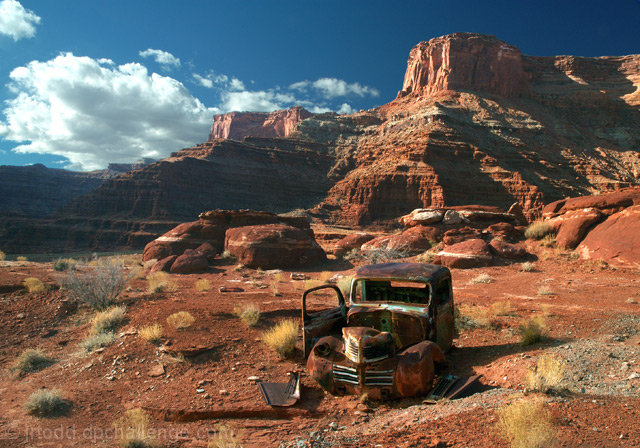
The bottom of this was real dark to keep the sky from burning out to much so there was a lot of processing.
Select dark area
levels 0-1.00-138
curves 229-253
Sat. Reds +12
Brightness and Contrast b +2 c +1
Gaussian Blur 1.0 each layer
Reverse mask
Levels 0-1.18-255
Merge Layers
Heal along ridge
UMS 83
Statistics
Place: 44 out of 833 Avg (all users): 6.6952 Avg (commenters): 7.5758 Avg (participants): 6.6086 Avg (non-participants): 7.1286 Views since voting: 2370 Views during voting: 592 Votes: 420 Comments: 34 Favorites: 10 (view)
Love the colours. Seems to have a tilt to the right. Perhaps a slight rotation left would improve visual presentation. Be careful of the blown hightlights on the clouds.
This image, although a GREAT subject and composition is the most tilted to the right out of all 321 images I've looked at so far. I don't see how so many can make this mistake or over look it, etc. Could use a more contrast. But still worth a 6.
I think this needs to be rotated CCW a little to get the horizontal bands on the cliffs level, then I think this should would be much better. I'd also up the contrast a little to make the colours pop more.
Great subject and composition. I would like to see this with a little more contrast in the rocks and ground. IN fact I'd love to play around in PS with it.
excellent idea, great comp, great texture, excellent light, great color, b&w need tweeking but minimally, great dof, nice lines, nice movement, overall have a print available
Good find! Very good tones too. I like the overall brown color theme. Two minor points: 1) I do think the truck is a bit too centric, and 2) while the shadow detail is commendable, a little more contrast might have added more mood. As is, it just looks a little flat to me.
this is a great image, the rusty color blends perfectly in with the red sand, however, I think it would help the image to crop a little bit of the right side, just to move the car an inch to the rightand sharpen it just a bit, everything else looks great
I like the composition. When it is all done I would like to see this in B&W.
this image may have been better if the rule of thirds was used. Still it is a nice image.
Nice composition, gorgeuous shot. A little more contrast in the dark areas and a slight bump up on the red channel saturation would make this "pop" even more. But as it is, really nice.
Beautiful is not the right word to use for this shot. Stunning, amazing, breath taking is just a start. Perfect composition, tones and DOF make this a 10 in my book. I only wish there were a 20 button!






 Add photograph to your favorites
 Add photographer to your favorites


 Photographer found comment helpful.


