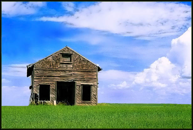
In this type of shot it's critical to not have any tilt to the image. This one is slightly tilted right. I like the strong colors (not over done at all). Great sense of blance between the sky, clouds, grass, and building.
This is the last photo I came to vote on, where I am leaving my 830th comment! Actually I've left more but a few photos have been DQd along the way! :)
I like the simplicity of the composition, compared to the amount of detail in the textures of the shack. I think the colours maybe slightly too saturated, but thats just personal preference. I think this would have looked good in B&W with really high contrast, but that would be the obvious choice! I like how you've chosen to do the exact opposite and create a bright colourful piece. Nice work.
"You have commented on 830 of 830 images (100%) in this challenge."
My initial reaction to this image was that I was impressed by the near perfect perspective and clean lines of this photograph. Then I noticed the area to the left of the shack... which struck me as weird, because it's unnaturally flat and lower than the rest of the horizon. Did you clone something out there? It really looks weird.






 Add photograph to your favorites
 Add photographer to your favorites


 Photographer found comment helpful.


