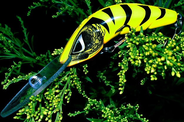
First impression: Eyes definitely drawn to the bright yellow, down to the eye, to the buds on the right and then to the line attachment area.
Picture is busy with the plant competing for attention. The black areas actually encourage the competition between the plant and the lure by creating such strong contrast. A different background, say a rock or a log would have given more attention to the lure.
Glare from the light source is distracting. A soft or reflected light would have helped.
Your colour processing and DOF work well for the lure. Cropping could be a little to tight though!.
Your file size is a little small at 626 x 416 and 106k. Try to push the 640 and 150k size
I think you met the challenge well, the lure definitely has an interesting shape, and the yellow and black definitely catch your attention
I would like this better, I think, with just a tad more space on each side -- especially the left. (Top and bottom are probably OK, but even there I might give a little more space.)
This image has a lot of things going on.
Its hard not to think that color is the major element, but the limited contrast between subject and background neutralizes the effect. there also is the pattern on the lure to consider, but the shape is still dominate.






 Add photograph to your favorites
 Add photographer to your favorites


