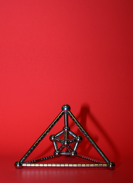
Utilizing neodymium magnets and steel spheres. I wanted an interesting shape for this challenge and I really liked how the red background came out.
I am going to endeavor to include in my entries my guess at the score. I think this shot should get a 5.5+. I have hopes it might even find itself in the upper 5's.
PROCESS:
Minor Rotation & Crop
USM & Curves
Re-size
USM
Statistics
Place: 120 out of 366 Avg (all users): 5.5182 Avg (commenters): 5.2857 Avg (participants): 5.3986 Avg (non-participants): 5.6397 Views since voting: 948 Views during voting: 346 Votes: 274 Comments: 9 Favorites: 0
Challenge
- Relevant to the Challenge? Yes. I feel the color is competing with the shape for importance in the image, though.
- Is subject unique (vs. unoriginal or rehashed)? That's is certainly one unique shape.
Compostion
- Good or Bad? How can it be fixed? I like the use of negative space and the vertically off-center position, however I disagree with comments about puttin the image on the right third. I'd like to see it on the left third because of the shadow. The shadows leads the eye to the right. If you cut off that shadow you essentially draw the eye straight out of the image. Put the piece on the left third and let the shadow lead the eye into the negative space.
- Good use of Depth of Field? Yes
- Good focus? Yes
Lighting
- Good use of light? I think the lighting is overpowering the image. The background is washed out, and the reflections off the piece are strong. Difuse the light.
- Good use of shadows? Yes. I like the shadows, but where the background curves, so does the shadow which bugs me. I'm not sure how to reconcile the two without flattening the background and raising the camera angle (aim down at the floor).
Aesthetics/Artistic Appeal:
- What is my reaction or feelings? In spite of the background, the chromy bits give it a cold feel. The shape interesting, yet unemotional. Overall, the image doesn't grab my attention.
You nailed your score guess, and this is your 5 best. Keep it up.
Thought I should get around to the critique you requested.
First Impression - the most important one: Very centred ... very red! .. good angle, nice to be able to appreciate the actual shape.
Composition: Brett and I discussed this one, the backing that you have used doesn't appear well set up ... if it was curved down rather than squared off it would have helped (I can get Brett to talk about this if you like) ... the squaring off have distorted the shadow and that need not have happened.
I think that it really should have been on thirds with the top of the pyramid hitting the horizontal line (I have included thumbnail to demonstraft badly). I think the there appears to be more about red than the shape ... take note of the others comments received, they are good.
Subject: I think you hit it and hit it hard .. well done.
Technical (Colour and light): This is hard there is too much colour e.g. too much top ... I don't know I just felt a bit too overpowered by the colour .... The shadow was also a bit of an issue, and that is how the object is lit from the front. Keep trying with lighting to remove these things if you like. I think you have made a good start.
To grow its vote?: What do I know .. you scored way better than me :)
Summary: I like it ... great advance of the previous one I critiqued, yet still quite cool ... shows you are also improving all the time.
I like the use of the Magnetix. I think it might serve you better if it weren't target centered, and had negative space to one side. The shadow is cool.






 Add photograph to your favorites
 Add photographer to your favorites

 Photographer found comment helpful.


