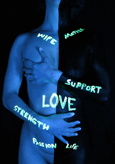
Yet another love it/hate it/outside-of-the-box/black light image from yours truly. I am probably more satisfied with the way this one turned out than any other image I've submitted. This one came out exactly the way I envisioned. I expect to get voted down again due to gratuitious nudity and unusual subject matter, but yet again, I really don't care.
This was a lot of fun to shoot, but very messy. When I told my wife I had a great idea for this weeks challenge that involved body paint and a black light, she looked at me and said... "I thought you were the one who had to suffer for your art!
This image very accurately depicts the way I feel about my beautiful wife. Her soft feminity is balanced by her strength as a mother. She is my heart and I thoroughly enjoyed having the opportunity to show everyone how I see her.
Settings Tv( Shutter Speed )
0.8
Av( Aperture Value )
4.5
Metering Mode
Evaluative Metering
Digital Exposure Compensation
+0.5
ISO Speed
800
Flash
Off
RAW Adjustments White Balance Mode
Fluorescent
White balance compensation
B9 M9
Parameters Settings
Contrast High
Sharpness High
Color saturation Standard
Color tone +2
Color Space
sRGB
Noise Reduction
Off
Statistics
Place: 55 out of 125 Avg (all users): 5.6179 Avg (commenters): 7.1429 Avg (participants): 5.5811 Avg (non-participants): 5.6311 Views since voting: 3161 Views during voting: 628 Votes: 280 Comments: 27 Favorites: 4 (view)
I think this is an amazing shot, from your creative thinking to how you executed it.
I do agree with the other commenters about the asymmetry in the hands. I think the best would be to paint the right hand black. It would add some visual interest. But that's minor.
First Impression - the most important one: Well, to be honest I was one of the ones who scored this a 10, so right off the bat, you know where my personal opinion of this piece lies. I think it is incredibly powerful, thought provoking, and well executed. That being said and upon closer inspection (and after reading your notes and the other comments given), I will do my best to provide some constructive feedback.
Composition: I think the placement of the subject and the crop were both good. A couple of people mentioned the differences in the hands and their placement - and I do see where that could have been cleaner. If you had painted her right hand black (in juxtaposition to her unpainted left hand) and managed their placement so that the dividing line matched up, that would have been ideal. Also, the fact that the word PASSION slightly overlaps into the black area (whereas all other words stay within their borders - except LOVE, which purposefully crosses boundaries). These are really pretty minor points, but obviously are/were noticeable and did affect some people's impressions of the work. The only other really noticeable difference in the symmetry is the placement of her head (where the angle seems to be off, causing the line to veer).
Subject: The subject matter was right on topic and couldn't have been more relevant to the challenge theme IMHO. I think you managed to cross most of the boundaries of motherhood (so to speak) with your interpretation and did so in a manner that not only spoke (literally) to the viewer, but showed your loving relationship to your wife as well. And BTW, including her C-section scar in the image was one of the cappers for me.
Technical (Color, focus, and light): I think your use of color was creative and well done - it again made your point of the numerous aspects of motherhood and the dual nature of a woman. The blacklight and writing was a cool effect, and although some people did consider the actual lettering to be a bit messy, I didn't think so at all. The fact that the "mother" allowed herself to be touched so intimately by the writer, said something about her nature IMO as well. I think the fact that you managed to eke out detail in black areas against black areas in black light, tells me that your lighting and focus had to be pretty darn good.
To grow its vote?: Little things as stated above. Personal tastes and a few minor details would have probably landed this much higher on the scoring ladder.
Summary: I'm really surprised it didn't score much higher than it did, but I do see now what some of the commenters were pointing out. However, I think this was an exceptionally strong entry that met the challenge perfectly and was very well executed. Great job and I look forward to seeing more of your work.
Since ya need another comment, I thought I'd go with your latest submission and give ya a quick critique.
Personally, I didn't think I'd be running into an image I like so much. Love your use of balcklights here. You have expressed your intention very well. I'm actually quite suprised it didn't score higher.
Perhaps your writing could have been neater. And the black on her wrist should have come up even with the divide down the rest of her body.
Palmetto, you asked me to clarify my dislike for your photo, I will try to do it now:
1- I think this is extremely creative a great interpretation of the challenge an sends lots of messages that I myself wanted to include in one picture. It is so true that a mother is lots of things at the same time as your photo says. Great message, we all got it.
2- On the photographic side of it, I think that bodypainting, and lighting was well done ( I might have tried to improve lighting by having more shades on the body, showing more volume, perhaps placing lights more at the side), but I didn't like the writing on the words because they seem too explicit for my taste and because they look as if you had done it with your finger... I get a feeling of too direct message along with poorly 'drawn' words. Also on the photographic side I think that there should be a completely black hand that crosses over to the white side (at least the line crossing through the wrist might have been better if angled to have visual continuity on the vertial line). Hand placement seems a bit uneasy and I would have loved to see a bit more detail on the skin.
3- On the emotive side I didn't like your choice of colors because they all seem too harsh for me, my mental interpetation of mother has all the words in your photo but they are all blended in a soft mixture, a delicate balance of emotions, a natural shift in roles... your photo seems too unnatural and hard for my taste, like a forced mother, more than a loving mother.
This is just an idea, please take it as constructive criticism, and of course I make lots of assumptions that are entirely personal. I am telling you why 'I' didn't like your photo, not implying respectfuly that it is a bad photo, and as I could see on the comments lots of people loved it and I can see why.
Perhaps you can feel that I had lots of preconceptions about this challenge, truth is I was inclined towards something really softer than your concept... and I looked and voted for softer tender images (as you can see my own photo).
Anyway congratulations for the effort (I can see you invested lots of time here) and thank you for your creativity, please keep it up.
8 for effort, I would have made a black hand cross over to the light side too, just like the white one does, also maybe play with the words and add some 'dark' ones..
I love it. Powerful and modern take on a really traditional subject. The duality of the split colours, the chioce of the electric blue colour and the flourecent words all combine to create a depth of communication that is best left to the picture itself. Awesome stuff.
Lee, you and your wife have a thing for paint... I have to give it a neutral score. I like the idea behind the shot, but I just don't like how it's pulled off. I'm generally not a fan of words in pictures, maybe that hurts this in my mind.





 Add photograph to your favorites
 Add photographer to your favorites

 Photographer found comment helpful.


