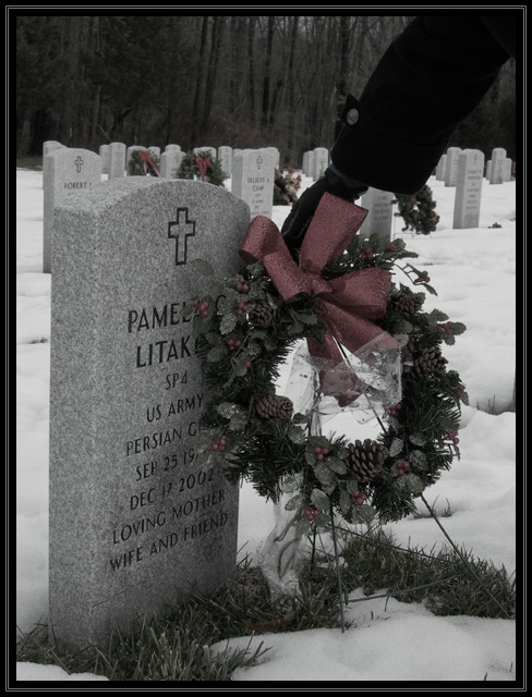
The arm seems awkwardly composed. I'd have to see some other stuff to know what would be better though. Perhaps a little more contrast. The snow looks fairly gray. 5
This is a really nice photo, and I'm giving it a high vote. The only thing keeping me from giving a 9 or 10 is that I think the arm is awkwardly placed. I would prefer the arm gone totally, or maybe if the person was crouched down in profile, facing the headstone.
It's a great shot though, I love the desaturation, it adds emotion.
beautiful shot, it really hit home, if the topic had been father i think i would have taken the same shot. I love the hints of red though out, that you didnt forget about the weaths in the back... great job
The colors in the picture seem a little bit dull to me, I really like the idea of the picture but it seems in between not enough color and b and w, just my opinion
very solemn picture. the hand/arm is very dark which makes it hard to identify as placing the wreath. a different color glove might have helped in this instance.





 Add photograph to your favorites
 Add photographer to your favorites


 Photographer found comment helpful.


