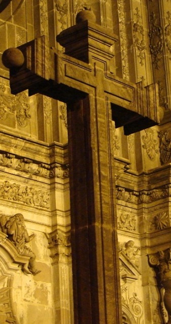
The cross almost blends in to the background. Could you have used a narrower depth of field to set it off by itself a bit more? Or perhaps a different angle -- is that the edge of a circular dark area I see up in the left? The cross against something like that would have been truly striking.
I like the idea and the tones here. The composition, other than the bit of circle on the left which couldn't be helped at that angle, is pleasing.
Nothing really sets the cross off from the background. It's all yellow. Maybe in b&w? Also, there's a lot of pattern in the background that draws the eye away from the cross.





 Add photograph to your favorites
 Add photographer to your favorites


 Photographer found comment helpful.


