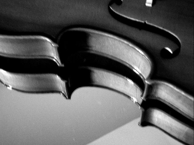
I'm still in the process of getting used to my new camera. I have trouble getting perfectly clear photos when the flash isn't on.
Personal critisms:
*needs to be less blurry (Im working on it..)
*Spots on the mirror- dust maybe?
*The diagonal line in the reflection from the ceiling meeting the wall
*The white light area in the reflection on the mid left side- I feel it takes attention away from the focal point of the curving "C" part of the viola
Statistics
Place: 350 out of 366 Avg (all users): 4.0528 Avg (commenters): 3.9545 Avg (participants): 3.9545 Avg (non-participants): 4.1504 Views since voting: 748 Views during voting: 346 Votes: 265 Comments: 26 Favorites: 0
3 - Good concept. The 'composition'/placement seems fairly good. Criticism; blurry mainly. Attention also paid to other aspects like the ceiling corners(?)/line reflected in the mirror, the few 'blown'/glare/reflection issues (but hard to control/adjust in basic) and the choice of cropping out part of the 'S' and the white 'something' cropped out (sorry don't know the correct term for it) would all have made this better in my opinion. Not sure that the b&w/toning works in this.
The problem with mirrors is that you get two reflective surfaces being the surface of the glass and then the silvering which is on the back. That's cost you here which is a shame. Also the camera shake hasn't made it any kinder
There's a problem here with camera shake.
Perhaps you could use a shorter exposure time, or a tripod.
A remote shutter-release controller will avoid camera movement during the exposure, too.
way too noisy, the cut-out in the top is cut off, the reflection is nice but is not taken advantage of. The bottom shows what I am only guessing is a reflection of the wall and ceiling. The bridge is just seen (or some weird white square).
Violins are beautiful instruments. But I feel this photo doesn't do much to capture that.
However, I am also guessing from the noise that this might have been a P&S. And sometimes it is very hard to transcripe an idea to film
This was a great idea for the topic, and I can't imagine what went wrong with your focus, unless of course the OOF was intentional, then it was a poor idea.
Would have been bliss if it hadn't been grainy, in my opinion (although it looks as though you did the grain on purpose -- just my personal preference). What a great idea and good composition. Clever title too. ;)
Nice composition, obviously, it would be improved with better focus and less grain. Also, I think the diagonal line in the background hurts more than it helps.






 Add photograph to your favorites
 Add photographer to your favorites


 Photographer found comment helpful.


