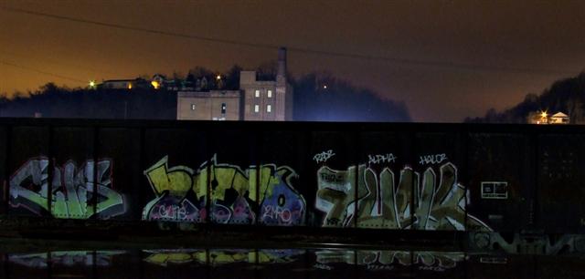
Shot in a sketchy neighborhood at 2:30am. Made sure to go when the guard shack at the local factory accross the street was occupied. first time experimenting with long exposures and no direct lighting.
Cropped, USM, Resize for web.
Statistics
Place: 111 out of 173 Avg (all users): 4.9918 Avg (commenters): 4.3000 Avg (participants): 4.7160 Avg (non-participants): 5.0704 Views since voting: 1099 Views during voting: 460 Votes: 365 Comments: 11 Favorites: 0
This is an interesting image that (imo) almost works. I think you are interested in the graffiti as the center of attention, but the light in the small structure to the right is what instantly takes center stage. It is so bright, that's where the eye involuntarily goes. Then it's back to the rest of the image, where everything is divided pretty much in half. Sometimes that works but here, I think the viewer is bouncing back and forth just a little much looking for the focal point. I do, very much, like the contrasts of style between the top and bottom parts of this image. Gives the viewer something to think about.
But in this case, perhaps the viewer (voter) had to work too hard to get to the interesting bits, and simply moved on.
I give you full marks for getting out after dark. Yes, it's scary especially when you have to set up with tripod or find a really steady place to work in a strange neighborhood. I probably would have used about the same settings you did, but sometime or someplace where you can feel more relaxed, try some 30 second esposures at ISO100 and various aperture settings. That might take care of the graininess. If you want to get rid of it, that is. In this case, I think it works.
I enjoyed looking at this image and am pleased that it came to me in the draw.
I have difficulty getting a read on this picture. The foreground looks conjures an urban, industrial idea, but the background impresses me as a chalet on a verdant hill. But I'm not sure, because everything is so dark. Also, I prefer a less distinct division between foreground and background. It's a perfect line that divides, which make the division look unnatural.
i love the reflection of the grafiti and ur pretty ballsy to be out there at night, up in the hood ;) but everything above the wall is really grainy and the lights seems all tweaked
I like the moody colours - suits the gang theme. The un-level horizon is more distracting rather than adding to the mood though and there is no real focus point.






 Add photograph to your favorites
 Add photographer to your favorites

 Photographer found comment helpful.


