Just a brief note, to begin... It really helps the Critique Club volunteers tremendously if the photographer is able to provide a little background info, shot setup facts, and editing steps in the "Comments" box. While this is currently not required, it does limit our ability to be thorough if there is no information included.
Composition
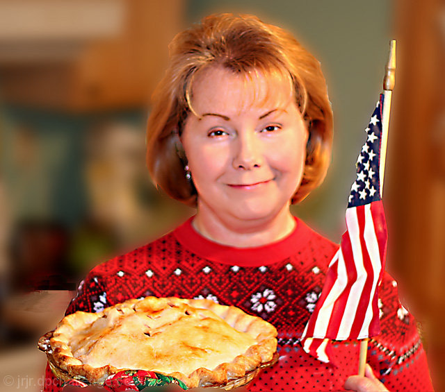
The nearly square crop makes the shot a little bit static for me. The subject is neither centered nor effectly offset from center, so my eyes don't go to any of the natural "spots". The crop is also a little too close to both the pie and the flag, making my eye wander out of the frame with regularity. Perhaps cropping so that her face was basically on the upper right "thirds" intersection and have her hold the pie on the lower left "thirds" intersection would have yielded more compostional punch.
Camera Work
There are quite a few hot spots (small, overexposed areas) in the image. This includes the stripes in the flag, the spots on her sweater, and even some highlights around her eyes. The use of the flash has made the image very harsh - much harsher than I think a picture of a "mom" (soft and sweet) should be. I think you've tried to correct for this later, but starting with a 1/3 stop underexposed image might have given better results. I would also recommend either diffusing the flash or using bounce flash off the ceiling. The bounce usually yields incredibly better skin tones. You've used f/1.8, and I would think it is intentional, seeing that you have increased the background blur with post processing. A smaller aperture (larger number) would have made it possible, I think, to keep the mom, the flag, and the pie ALL within the depth of field and made a much stronger image. If you were indeed using a flash, you should have been able to do that.
Post Processing
You received several negative comments about the processing, and I don't want to rehash unnecessarily, but some things do bear mentioning. The pie looks pasted in, the reds are oversaturated, and the blur / noise removal to her face are dominating features which really detract from the image. If you would like to discuss this further, feel free to drop me a PM and I will be glad to go into more details.
My Thoughts
This is a nice idea and a beautiful model. Personally, I really would like to compare the orginal from the camera to the end result and perhaps explore some different PP paths. I think this could have been made into a stronger image than you have submitted here.
I apologize if this comes across as a harsh critique; I don't mean it to be unnecessarily so. I do make a specific effort, when doing a critique, to be as blatantly honest as I can without being rude or obtrusive. My intent is to help the photographer improve as much as possible. I hope you find these thoughts to be helpful and informative. If you have questions or would like to discuss further, please feel free to PM me at any time.
Now, this is a very cute pose and wonderful wholesome smile and i even like the color treatment as an end effect. I just feel that there is a disconnect between the coloration of the flag and the face. There is also a definite cut out appearance around the subject. despite all this the pie, the flag and the expression trump a lot of these minor inconsistencies. Bumping to 7 on general impact which can not be denied.
Some really bad photoshopping around the head and background spoils it for me. But a good message, meets the challenge well (pity about the post-processing)
Seems to have some weird lighting going on. Keep working on your post-processing skills. Hair is really hard to outline properly. Try a feather to your selection or blurring the background on a separate layer and then erasing the parts on that layer you want in focus with a soft-edged eraser. That may lead to better results. I like your idea though.
Interesting idea. The image looks as though it has been heavily processed which gives it a strange kind of appearance. Maybe too much sharpenning or similar. The idea of an iconic portrait portraying cultural heritage is a really good idea though.
The post editing on this pic has made it look out of focus. The colors are horrible and just not pleasing to the eye. The lighting is bad and looks overexposed. 2
Over processed, but nice idea. I think the backdrop coulda been better, and there's some really weird blurry thing in the lower left. It looks pixelated rather than blurred. Also NI-ed to the point of plasticity. 3
Lots of red usually does well with me, but you've been a bit heavy with the noise reduction, in this case, I think. Looks like a great pie! :) Great thought.
oh my!!! I will be respectful but I have to tell you the truth. Good idea, good composition, horrid digital work. borders are awful, there is something distracting on the left side by her shoulder, her face looks like plastic, hair unnatural, flagh by the stars terribly finished, and the background unnaturaly blurred. Sorry, I think you distroyed a good idea :S
You made an effort with your Mom, flag and pie.... I'd be ok with those.
However, the post processing (or did it come out of the camera looking like THAT?) totally ruins it.







 Add photograph to your favorites
 Add photographer to your favorites

 Photographer found comment helpful.


