Levels, crop, a little neat image.
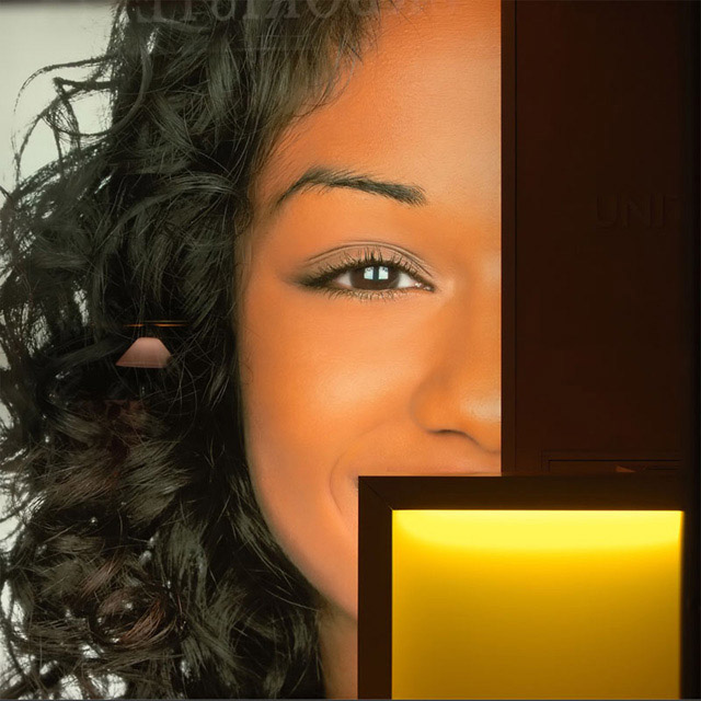
Walking in my city, i was giving a look at shops thinking that Christmas was over...I liked the squares I saw inside that shop.
Statistics
Place: 185 out of 366 Avg (all users): 5.2437 Avg (commenters): 5.5333 Avg (participants): 4.7676 Avg (non-participants): 5.7372 Views since voting: 1037 Views during voting: 407 Votes: 279 Comments: 16 Favorites: 0
First Impression - the most important one: Interesting picture, is it real ...
Composition: A couple of issues have come up in the comments re your composition, and the artifacts in the reflection ... this is often the way when you are photographing glass and hard to eliminate without the advanced editing options.
Subject: I don't know that you hit the subject well. Yes there is a square and a rectangle, but they are not the subject the girl is.
Technical (Colour and light): This is lovely and well done.
To grow its vote?: Hard to do here, as it is potentially off subject, the reflections have also dampened peoples opinions.
Summary: You found an interesting subject to photograph. You can tell from the stats that some liked it and some didn't. You can not appeal 100% to everyone. I look forward to seeing more of your shots.
If you've got any questions about this critique, please feel free to contact me via the PM system.
This is fantastic! Basic editing and you accomplished this? WOW! Hats off to you and I can't wait to read how you did it! Congrats on pulling off a terrific image. 10
Except for the reflected lamp midframe to the left and the reflection artifacts at the top, this would be a 10. Wonderful image. Bright. Beautiful focus. Love the Mondrian rectangles. Cute model. Absolutely terrific composition. Might be a little heavy on the noise reduction but I can certainly live with that. Then there's that darn lamp. Still a great shot! Deserves a top 10 if not a ribbon.
The reflection of the lamp in her hair isn't good. Is this actually a person, or a billboard behind a window? She is beautiful, but the skin looks over processed. I love the composition. Its intriguing.
Intriguing. Looks like a portion of an ad. Where the reflections of the light fixture and text intentional? The title draws my eyes to the incomplete yellow square and sends me looking for other squares to no avail. Excluding the title, the shapes within the locks of hair, face and and right-most UNI text are very interesting.
This would have got amuch higher vote if there was not the reflections of the light and the writing on top of the picture, i really like the idea, and the colors, just stands out strongly to me because instead of hair i see a lamp. 5







 Add photograph to your favorites
 Add photographer to your favorites


 Photographer found comment helpful.


