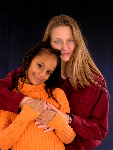
There's something about the colors of their shirts that is not working for me. Individually, they work okay (adn orange looks really good on her!), but I think the orange sweater may be dominating the scene and taking away from their faces.
I think I might like this better in black and white. The strong colors of the shirt and sweater really compete with what I really want to look at - their faces! My eyes are continuously drawn to the orange especially. I do like the way they are positioned together, it's so sweet.
Nice composition and lighting. I'm not crazy about the orange sweater with the maroon shirt. I would have spaced their heads just slightly further apart. It looks like mom is resting her head on daughter's hair.
Not too keen on this shot. I still gave it a five, but the colors all clash to me and just looks like a portrait from Walmart, to describe it the best way I know how. The little girl is darling though, and looks like a lot of love there, which is always nice to see.
Beautiful!!!! I love it that it's in color. Usually people tend to always make shots like this black and white -- but the vibrant colors really add to this one. Good luck. I really love it. 10







 Add photograph to your favorites
 Add photographer to your favorites


 Photographer found comment helpful.


