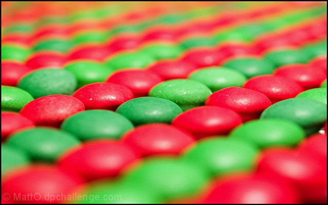
The good: I like the diagonal swoop of the composition and I like the choice of complementary colors.
To work on: I don't like the glare of the light. Had you been able to do this in a softbox, I think it would have been superior. The DOF idea is ok, but I'd like to see it with just a bit more focus. I tend to get distracted by foreground bokeh too as it takes up a relatively large portion of the picture. (That being said, there are many of people who can use this to good effect.)
It's interesting, but not beneficial, how the M&M's converged their colors where it's blurry to make a yellowing halo. That's not helping the pic, but I'm not sure what you could do about it.
Overall, I don't think it's a bad picture. 5.3 is probably a fair score (and not even a bad one). You did almost as much as you could with the idea, I guess there were just better ones out there.
A break in the pattern would have generated more interest - perhaps a blue or brown one replacing one on the thirds that is in moderate focus. Good pattern none-the-less. Perhaps also a bit more DOF (double it)?





 Add photograph to your favorites
 Add photographer to your favorites

 Photographer found comment helpful.


