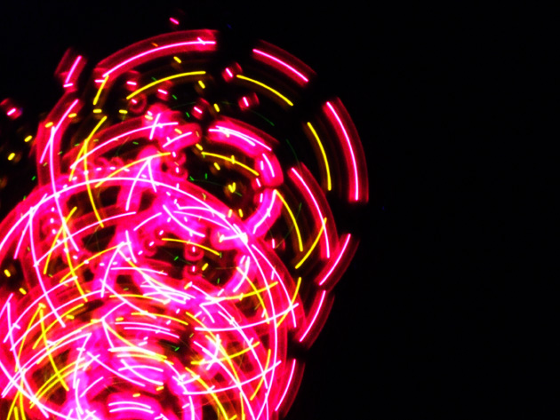
Took hundreds of shots of loads of things for this challenge but in the end I got this shot after my brother bought a 99p spinning fan with flashing lights on it.
processing
curves
resize for challenge
after challenge: Ok I didnt spell the title spinning oops!
Statistics
Place: 167 out of 240 Avg (all users): 5.0292 Avg (commenters): 6.0000 Avg (participants): 4.9369 Avg (non-participants): 5.0812 Views since voting: 1182 Views during voting: 392 Votes: 308 Comments: 7 Favorites: 0
Before i start nothing that is said here is meant to be offensive. Ok first off, spelling mistakes in the title are a big no no, because unless you are using the title as a play on words a mispelling is going to bring you down.
Technically this image is not very interesting. In order to do well in a chellenge on this site you must have something interesting that really grabs someones attention. The exposure seems to be correct because the lights are not blown out.
Overall i think what really brought this image down was the fact that it was not eye catching. It just seems like a run of the mill shot.
Keep up the good work, and keep learning from all those around you!!
If you have any questions or comments just PM me,
-Dan Gruskin
I admit...my eight-year-old daughter and I caught the spelling mistake. We were wondering if it was a special kind of light CALLED a "spining" light? LOL I scored it on the low side, too...also because it didn't seem to have sharp focus, and I prefer more natural images over "abstract"-type photos. Just personal preference, polkop...and spelling mistakes bug me a bit. I see you spelled it right in your comments. ;)
For what it's worth; People tend to punish those who make a mistake in spelling..spining instead of spinning could hav put people off the photo. I scored this rather low because I thought a pattern was not the really displayed but a spinning light and I wasn't sure what to think of the focus or lack thereof. I did like the colors though. Remember also that people only give themselves a few seconds to score each image and any little flaw will make people go for the lower numbers....looking at the voting breakdown, you will see it's a very typical curve and 5+ is an average score, not bad..
I gave you an 8. i really like the colors, the subject position, and the pattern that was left in the picture. I think one of the main reasons it may have been scored lower then IMO it deserved was here at DPC if you get too creative you get knocked for it. Check over the previous ribbon winners. You will see MANY photos that are very similar for the top 3 ribbons... People are stuck on what they like. But great photo, I really like it.
I gave this a 4. There was a pattern there but in my opinion the colors were too harsh (ie: contrast/etc) and the pattern a bit too 'busy', especially for the composition. Also 640 width (height too perhaps) may have helped this, again, with a slightly different composition, depending of course what you had to work with.
I gave this a 4. There was a pattern there but in my opinion the colors were too harsh (ie: contrast/etc) and the pattern a bit too 'busy', especially for the composition. Also 640 width (height too perhaps) may have helped this, again, with a slightly different composition, depending of course what you had to work with.





 Add photograph to your favorites
 Add photographer to your favorites

 Photographer found comment helpful.


