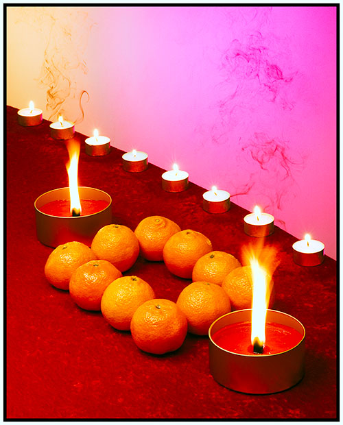
This is creative but I think there are too many patterns competing here. There is the diagonal blocks of color, the line of the voitve candles, the square shape created by the round oranges, the larger candles and the verticals of their flames. It's all too much so the eye doesn't really know where to rest.
I like part of this image, but there is another part of which I'm not particularly fond. I think the pattern aspect would be much stronger without the addition of the oranges and the foreground candles. The contrasting red/pink background and the row of tealights at an angle is perfect for the pattern, but when you added the foreground elements it broke it up (all my uneducated opinion of course) I think it dissipated the effect. Without those things, and maybe angled just a tiny bit (2 or 3 degrees) clockwise, I think you'd have a winner. :)






 Add photograph to your favorites
 Add photographer to your favorites


 Photographer found comment helpful.


