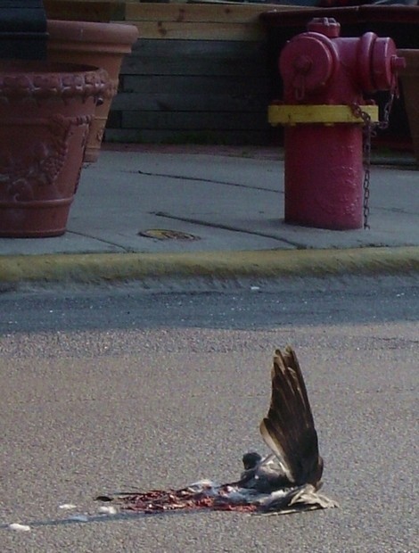
A former pigeon, on the street in the morning sun. The way the wing was just up, that way, drew my eye, and I dodged cars to get as close as I could to snap this shot. I suppose the question is obvious enough to give a quick answer to: "What happened?" "A car hit a pigeon." But somehow to me it implied a sort of natural drama.
Statistics
Place: 81 out of 88 Avg (all users): 4.4375 Avg (commenters): 5.0000 Avg (participants): 4.3594 Avg (non-participants): 4.5000 Views since voting: 1051 Votes: 144 Comments: 18 Favorites: 1 (view)
Really unpleasant photo... I'm sure I won't be the first to say so. As a photo... the focus isn't very sharp, and it could do with a levels adjustment in Photoshop, there doesn't seem to be enough tonal contrast. Don't like the shadow running mid-way across. The top half of the photo looks carelessly composed. I don't like the way the pavement cuts the picture in half. 3
I like the contrast of the drama and emotion of the dead bird with the random everyday items behind. It gives this image a sense of meaninglessness. Nice work.
Okay, I'll hit you...Not sharp enough, bad lighting, disgusting sujbect matter. =) Wow, I've never been that forrward in commenting. It feels like I"m being a jerk.
The concept is OK. Colours are rather dull, greyed out, almost softish. It seems to me that for this concept you'd need either a strong duotone/bw presentation, or better colours. Also, I think the vertical format doesn't do justice to the picture: all the distracting elements to the top are "distracting". The flower pots in particular give a sense of peace and tranquility that doesn't seem to go with the dead bird. I guess, what I'm trying to say is that in general a good photo addresses one concept or issue squarely, no distractions (remember, I said "in general"), and in this case I don't see why breaking this general guideline helps.
I like the composition (though the subject choice doesn't appeal that much), but the exposure seems off somehow. It is bright enough, but there doesn't seem to be a lot of "detail" visible. (Of course, that might be a good thing)
HM ok this should be fun ;) I think its too flat needs some more contrast and the picture itself I would like to see it taken from another angle mabey turn the camera landscape or something I dont know .... the stuff above (red stuff, dont know what its called) is a little distracting from the bird. Anyway Thats all I could find to say. Good luck ;) - 6
This one's a top "gross"-er. The splat is too unfocused (intentional?) that it makes me want to probe the picture more closely to know if it'sreally what I'm thinking.
My eyes are not sure where to look. The curb divides this into two separate shots for me - both not holding a lot of interest although I tend to lean toward suggesting a crop about halfway and just using the upper portion because I have a bit of an aversion to dead animals. Focus seems a bit soft - but I imagine you were in the middle of the road trying to snap this pretty quickly. Overal this is ok but doesn't hold my interest = 5
I see you have HM in the title so I assume you are looking for a non-surgar coated critique. Well, here goes, the image is very graphic in color, I would suggest B/W to tone it down a bit. The focus is soft on your subject, and the background objects are distracting. I think if you were to change those items, it would be a more compelling image........
The title suggests that the Questions have been answered. Also, it doesn't raise any questions in my mind. So I don't think that it fits the challenge well. A bird was hit in the road. Also a very not pleasant subject. The lighting looks poor, and thank goodness, the focus also seems soft taking away a lot of the detail of your subject. The background is quite too dark, and overall just not a pleasant shot. ~Heather~





 Add photograph to your favorites
 Add photographer to your favorites


 Photographer found comment helpful.


