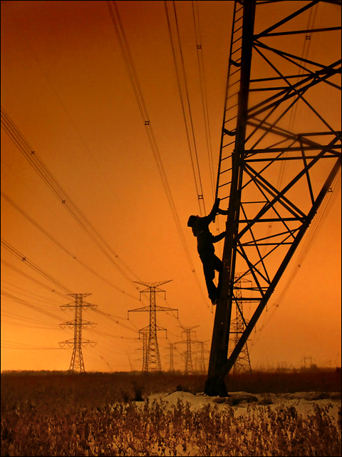
I guess I'm just missing something here, because I still don't get it...
if they were telephone lines I could make it make sense (wavelength of the sound being carried)... but the connection that this image has to 'wavelength' still evades me. perhaps you can help me out?
btw - thanks for commenting on my submission - I respect and value your opinion!
I keep coming back to this shot... it's captivating. I love the orange tones and the silhouette is awesome. I hope it's not skipped over in the voting by absent-minded voters. :)
Very nice, love the silhouette and composition in this picture still not quite jaw droppingly awesome but good enough for a 9 from me, one of the best in the challenge. Only to nitpick a bit, there are a couple of ares in the shot that are "smudgy". One in the middle of the stairs and also one of the bottom of the mast that is closest to the one he is climbing at. Is your lens dirty or is it something else? Anyway, didnt let that affect my score, just thought I would point them out to you if you hadn´t noticed. Good luck in the challenge!
I've seen some very interesting and great photographs of powerlines. This one definately ranks among the best of those. The originality in composition really make this one a standout!







 Add photograph to your favorites
 Add photographer to your favorites

 Photographer found comment helpful.


