---Brightness -4
----Shadow: adjust dark colors only -30
-----Resized
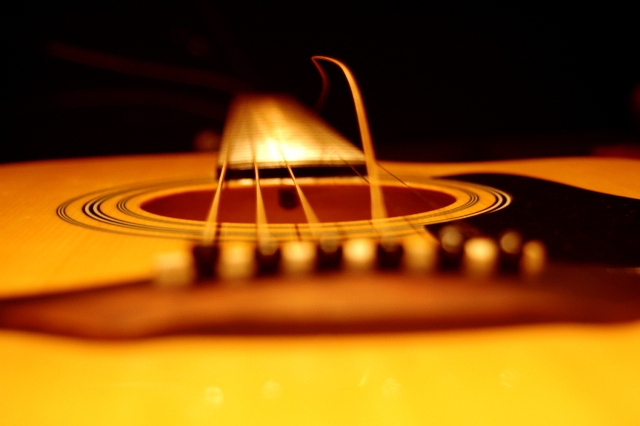
The Black back is actually a desk and the Guitar is on it's closed case i took like 8 different shots and the focus on hole was the best one. if i just focused on the string then the hole was a bit blury. Just took a few shots before my sister changer her broken string. Lighting was a few can lights that were in the room one was behind me. Thanks for the posts im excited on my top 20 finish =) =) i will defiantly make this a print just for kicks =)
Statistics
Place: 16 out of 100 Avg (all users): 5.8564 Avg (commenters): 5.9048 Avg (participants): 5.8913 Avg (non-participants): 5.8521 Views since voting: 3283 Views during voting: 608 Votes: 411 Comments: 29 Favorites: 2 (view)
I'm a sucker for shallow depth of field and I like how you've used it here. Added to the great lighting - love how it picks out that broken string - and the high saturation colour I think this is a great, high impact image!
im seeing the focus point right in the middle, i love the color cast and teh lone string in the middle, its a really great capture of something you dont see from this point very often,
great Job
This shot was one of my highest scored photos in this challenge. It's a beautiful photo and fits the themes. Many photos that ranked higher than this can't even match in terms of quality - only humor.
Interseting angle, and subject. Meets the criteria well. The highlight on the neck is a bit distracting though. I'd have prefered more controlled lighting.
First of all, I like where the DOF is going, but perhaps the subject of focus (the string) should be sharpest as opposed to the circular rings underneath it for a more dramatic effect.
Cool picture but I can't tell where the focus is...seems like the DOF should be bigger (maybe going from the bridge to the other side of the hole so there's still an OOF neck).
5 - Good idea/potential. Criticism; sharper focus on the string (overall the shot seems blurred or out of focus), nudge rotation up on the left, or else perhaps more 'diagonal' composition and perhaps a variation in lighting to diminish the 'blown' part, may have made this better in my opinion.





 Add photograph to your favorites
 Add photographer to your favorites

 Photographer found comment helpful.


