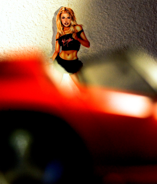
I'm not sure I understand the message presented. The photo itself, IMHO, is cluttered with a lot of info that is either extraneous or confusing. The red out-of-focus element in the foreground is more of a distraction than anything (is it a shoe?) and the hot spots on that same element really pull the eye away from the figure, which is what I assume is the main subject. The image is not evenly-lit, which is a bit distracting as well, especially in the background. The blown-out area on the left contrasts a bit too heavily with the darker area on the right. The texture on the wall is a bit of a distracting element as well. If you could seperate the subject from the background more, it would be smoother and more pleasing to the eye. Please take my critique with a grain of salt, because I am no pro. I just wanted to offer my immediate thoughts.





 Add photograph to your favorites
 Add photographer to your favorites


 Photographer found comment helpful.


