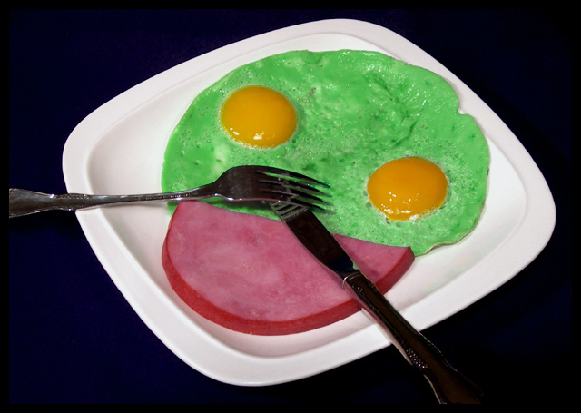
Looks a bit like homer simpson. The lighting here is harsh and the colors are unappealing - as you meant them to be. Although the plate is centered in the image, there are other design elements that work very well here to capture the viewers attention. Your leading lines (fork and knife) lead straight into the image and your subject has three focal spots arranged in a triangle which keep the veiwer looking at the image. This is important in a contest like this where the voting is done quickly. The longer the look, the more your photo is appreciated. I still find it unappealing, but I did look at it for a long time.






 Add photograph to your favorites
 Add photographer to your favorites


 Photographer found comment helpful.


