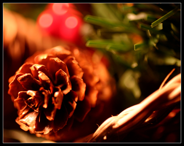
Nice use of shallow DOF, although I thikn the pine cone is lacking focus. Focus should be real sharp on the subject in my mind. The red blulb that is in the background, just above the pinecone would have been better if it were blue - would have made the color combination more pleasing. As is, the red brightness takes away from the natural color of the pinecone. Composition is good.
I think this was a clever concept, but even the pine cone is too softly focused. Something in the photo needs to be sharp with the surroundings blurred by the shallow depth of field.
I like the tone of this alot, but I don't see anything that's truly focused. Maybe the tip of the pinecone, but it seems oversharpened. Hmmm can't quite put my finger on it.







 Add photograph to your favorites
 Add photographer to your favorites

 Photographer found comment helpful.


