Author Thread Comments Made During the Challenge
Post actions
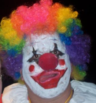
With a bit more focus and more space around his head, I would have scored this higher.
Post actions
This image is too small. Could have been larger to show more detail. I think the contrast on this image is too low. A bump perhaps. 5
Post actions
he's either drunk off his arss or he's having a stroke.
Post actions
No thought on exposure and composition.
Post actions
I like the concept. The pic looks too much like a snap shot.
Post actions
Post actions
Post actions
The picture is a bit out of focus
Post actions
Seems a little out of focus, and the clown's hair is chopped off on the left. Would be more scary if there were more space around it.
Post actions
Scary - better sharpness / focus would help.
Post actions
Post actions
Using Coulrophobia- Fear of clowns - in the title might have helped. I don't get the Stephen King reference but understand what he writes. I found the picture, very small, quite blurred and centred. It is a good concept, just didn't quite work this time.





 Add photograph to your favorites
 Add photographer to your favorites


