Damn, this is awesome. beautiful use of muted coloring.
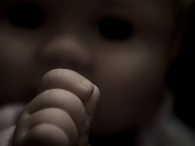
I noticed that the image itself is quite small (58KB). This shows itself in two ways. One I dislike, but is irrelevant (jaggies on the hand) and one I do like. I notice that there is some JPG artifacting around the soft gradients in the contours of the face in the OOF area.
It's like a series of steps. It really gives the background some very subtle feeling of depth, and really does draw you in (like the other comment).
I think I know why this scored low..because it doesn't whack you over the head..I could breeze by it if I had voted on this challenge, but once you stop and really look, then you are slowly drawn in..and the very lighting that might have prevented a low score becomes the very source of intrigue..and so the challenge becomes so much less relevant..well done..
Hey, Artyste - for me it was something a little different. The hollow-looking eyes certainly were creepy, and the dark (but not too dark) shot added to that mood - so you got bonus points for the emotive aspect there. I think it was more that the hand wasn't an incredibly interesting part of the shot. I put yours in the top half for sure because of the (creepy) mood and execution of the challenge, but I didn't put it at the top because of the subject.
As for #4, I was a little put off that so many people voted for the bird/etc. pics. Agreed that the subject is framed because of DOF, but in no way is it a 'creative' use.
I don't know why this scored so low.. but I have my theories..
1: Too dark. I don't think a lot of people have their monitors calibrated properly, but that's a danger with any darker image you submit here. Were it advanced editing, I could have done things to improve this.
2: Lack of true focal point. The hand is my focal point, which was designed to grab you, then let you wander off up into the fading face and empty eyes.. (which worked for some of you.. woo hoo!). However, because of the lack of advanced editing, I had to do edits which degraded the color quality, and had to use a blur method which took the sharp focus off the fist, making it seem fuzzy too. Le sigh.
3: Scary factor. I had comments that it was *too* creepy. I love that on DPC, you get penalized for doing your job too well.
4: Misunderstanding of Challenge. I'm still convinced that far too many people have no idea what Shallow DOF really *IS*.. Look at the blue ribbon winner. That's not really Shallow DOF. Sure, the background is completely out of focus, but the main subject is entirely *in* focus. The background could have been 3 miles away, we don't know. Anyway, this theory is last because it's the least strong. I'm sure I got hit for it, but not as badly as I thought at first.
Thanks everyone for some wonderful comments. This is currently my best ever lower scoring challenge photo.
This image is terrifying. The way the eyes dissapear is what gives it that quality, combined with the desturated colors which makes it feel "dead." Nicely composed, if you were going for creepy, you were quite succesful.
I confess, I didn't like this image at first. I didn't like the title because it felt to me like it led me away from the meaning of the photo. There is nothing in brilliant focus. And yet it is a powerful image. I kept coming back to it. And I kept bumping it in my voting. It's now among my top picks. Congratulations on a superb image.
Fantastic shot. The darkness and the shallow DoF add a sense of horror, which is not maybe what you were going for, but thats what it evokes for me :P Maybe I was traumatized as a child, hehe. 10






 Add photograph to your favorites
 Add photographer to your favorites


 Photographer found comment helpful.


